 Skip to content
 Watch our video (above) and find out how to design a great homepage.
Hi there, this is Kellis Landrum from True North Social. We are a digital marketing agency based in Los Angeles California. We specialize in eCommerce website design, as well as social media and SEO. Welcome to the latest installment in our series about ecommerce web design. Today we are going to talk about how to make a great homepage for your Ecommerce Website.
So I thought we would start with talking about what makes a really good homepage design for an ecommerce store. This is generally the first thing most merchants think about when they start thinking about their online store. In fact most people think about their ecommerce website, what they see in their mind’s eye is the homepage. There is a lot of different things you can do with a homepage. But there is a strategy behind it, or at least there should be, right? It could be that you have a great business in retail, maybe you’re doing wholesale and you’re thinking about opening up an online store and extending that business online, which is a great idea. A lot of times it is a little bit difficult for merchants to wrap their brain around how to talk about who their company is, or what their company offers. Usually the homepage is the place they want to do that. There is a particular way to do that, that we have found to be very effective.
The word I want to drill home to everyone watching this is merchandising, right? If you are in a physical store, especially any chain store that you have been to in a mall, they have an entire team of people dedicated to merchandising. What that means is there is a plan behind getting you to do certain things, or buy certain things when you come in contact with a merchant. Any merchant should have a strategy around how they are going to get people to buy a certain product, push traffic to a product category page, how they are going to promote seasonal events like Labor day sales, Black Friday sales, if they are going to promote certain specialize things that people can buy through their website, that maybe they couldn’t buy through others.
This is basically where you want to educate people about what is unique to your store in particular. So with that in mind I am going to break down a couple of examples of sites we have designed, as well as templated stuff. I am going to use Shopify as an example, but the same basic ideas would apply if you wanted to do a ecommerce site on Magento or Woo-commerce, or anything else you wanted to buy on. The ecommerce principles apply the same across the board. Whatever platform you’re building on, the method to get you where you want to go might change up a little bit technically.
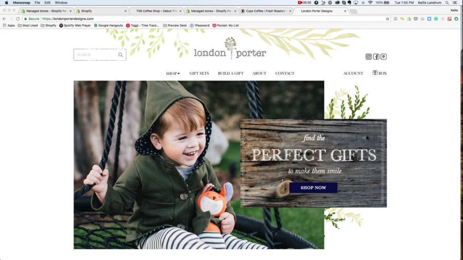
So let’s start looking at this site London Porter that we designed. So let’s talk a little bit about how this site merchandises. I am going to prefix this by saying London Porter is a company that sells gifts for children, and they are fairly high end gifts. They are fairly expensive, this is not the kind of thing you would buy at Walmart. As an example, we did a photo shoot for these guys, you will notice this child is wearing this jacket with this hoody and these striped pants. He has a toy fox and the fox is wearing the same hoody and the same pants as this kid. This is a fairly high end gift, right? Their idea was they were putting together these high end gift boxes with high end gifts in them. They needed some help communicating the value of this gift, right? So we talked to them about, okay what is the mindset of the person who is purchasing this? They really– someone who buys this type of gift, they want to use this gift to communicate something about themselves, and the way they feel about the people whom they are giving the gift. If you’re spending $20 on a gift that sends one thing, if you’re spending $150 on a gift, that says something a bit different right. So the idea here is, these are potential customers who have money, and they are not just buying any gift. They are looking for the perfect gift. Some fantastic gift to be able to give to people. So we put together a banner. You will notice this doesn’t explain the entire concept, right? The only real goal is to create something eye-catching. If they don’t do anything else to get them to click on the shop now button, and go to the shop collection and start seeing some product pages that they might like.
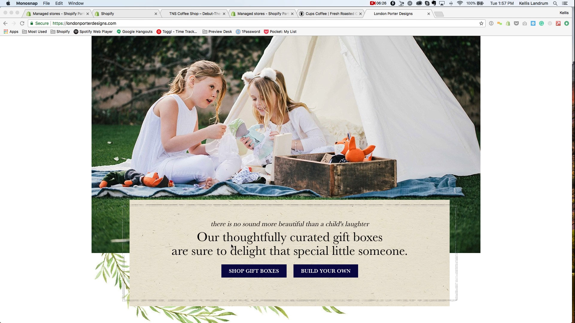
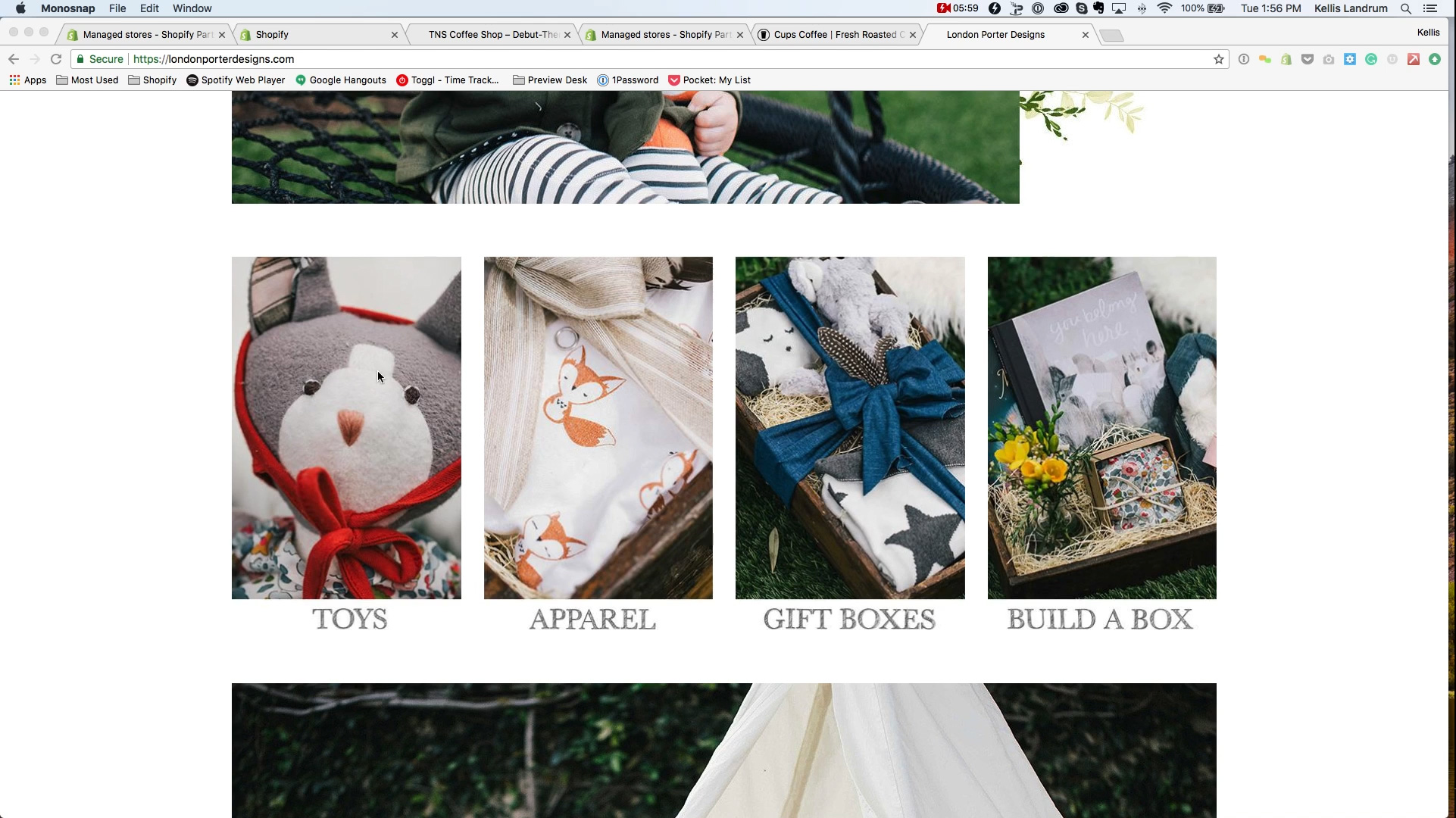
Next we have a series of collections. They have a collection of toys, a collection of clothing, a collection of pre built gift boxes, and a collection– and a build your own gift box, which is something very specialized we did for them. As we scroll down we see a little bit about thoughtfully curated gift about gift boxes that are sure to delight that special someone. You can either shop gift boxes, or build your own.? One of the things we clearly wanted to direct people towards was either building a pre-built gift box, or using this build your own gift box feature. So you will notice there is not a lot too this in terms of choices. There is only two choices to this, right? I think this section actually has the most choices which is four if you want to look at it that way.
One of the rookie mistakes I see a lot of newer merchants making, who are trying to DIY this is, they just throw too much at a customer all at once. They ask them to read and give them too many choices. Instead what we like to do is take the approach of spoon feeding people a couple of choices, then letting them find their way through.
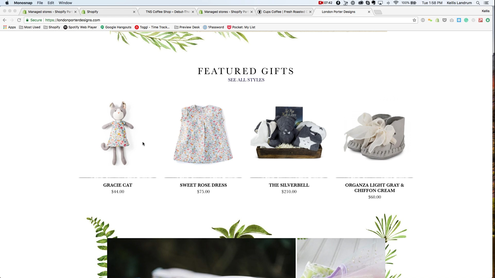
The next section is featured gifts, notice there is only four of these. You can go more than four, maybe eight or something like that. But again, I wouldn’t overwhelm a customer with choices right from the get go. I do recommend showing a few featured product images. I generally recommend whatever is your easiest sell, whatever is your low hanging fruit, put it on the homepage. So if somebody were to come here and say, I don’t know what to buy, I am not sure what kind of gift I am getting for this child– oh there is a cool little cat, here is a nice box, maybe I should just get one of those. Sometimes you will get these people who are just in a hurry, they just want to get something and go. They will see one of these items, they will add it to their cart and checkout, all within a space of a couple of minutes. I find a lot of merchants don’t want to believe it’s this easy, but these are actually your best sales. The people who you don’t have to convince; they have money, they just want to get something nice and move on. We generally recommend this. The bottom line is that you need give users very direct actions to take- look at a product, give you their email address, enter their credit card number, etc.
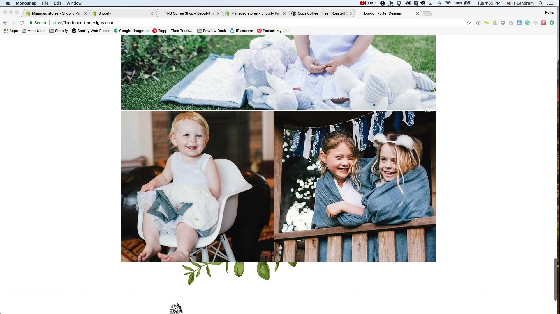
Since we shot a lot of photography, we decided to show a lot of nice lifestyle images on here. Photography sells better than anything else. A picture really is worth a thousand words. Showing pictures of products that you sell, that give someone an ideas of the lifestyle, this goes a long, long ways in just branding. It separates a commodity product from a branded product. If you’re just looking at a big pile of toys, you are tempted to go, okay what is the cheapest one? Then move on. But when you really start to look at nice photography you go, what’s really nice? What is going to make this person think that I picked out a really thoughtful gift for them? Or what does this product say about me? What can I envision about the person who is going to receive this gift, how happy they are to get it? Being able to show these things is really valuable and worthwhile. This is just a general example of a merchandising strategy on a homepage.
Just to briefly mention the last video we did, header and footer. The homepage is sandwiched between the header up here, and the footer down at the bottom. So your homepage is going to be whatever you’re working with in-between the header and footer.
Now to kind of breakdown what we would recommend as best practice; I know I mentioned customers don’t read they scan. I want to show you kind of what this looks like when someone comes to a site. We have done user testing, we watch people scroll through our websites and look at them. Here is kind of what it looks like. They will load the page and go, ow perfect gifts. Toys, gifts, box sets, I like that gift box, oh those kids look fine, curated gift boxes that’s a great feature, gifts, ow I like those gift boxes, pretty pictures, those are really nice. I did like this one box maybe I will click on that. All of that, that was probably 20 maybe 30 seconds of time I spent scrolling through this entire page. Here is where I’m going; when people come to an ecommerce website, they don’t read, they scroll through the entire thing in maybe 20 or 30 seconds. They don’t read text, they just read headlines. Sometimes they don’t even read that, they just look at pictures. And go, oh what did I find interesting? Assuming they have found something interesting, they will come back up to it and take a look and go into it. They might bounce around your store a little bit this way. But what I’m saying is, do not make your homepage text heavy, don’t make people have to read or really think about where they are going, because they just won’t. If you’re going to make them read, assume they will read two to five words at a time, so make those words big. This is about perfect gifts. This is about toys, apparel, gift boxes, and building a box. This is about thoughtfully curated gift boxes, who cares what the second line says. And featured gifts and a bunch pictures. Really, most people like looking at the pictures. So this is just kind of an idea, giving people some very obvious calls to action. People will generally click on buttons. One thing I recommend is some out of the box themes will make the buttons a link. What we try and do if we design custom themes is, if you have a button sitting on a big picture, make the entire picture clickable. I don’t know if you can see my mouse hand over here, but when I hover over this picture anywhere I see the little link hand appear. When I roll off of it, it just goes back to the arrow curser. It’s because this entire box here that the image sits in is a clickable link. Same thing for these four pictures, you can click anywhere in these four pictures. This is what you call a hit target. The hit target is wherever someone can click to click through. You want to make those areas big. This is twice as true on a mobile device. People’s fingers are tapping on their phones. If you have big fat fingers like I do, maybe not as nimble. So if you can, the only exception to the rule is if you have more than one choice. In that case it’s fine. But you will notice that I am directing people to a destination to go. The shot now goes to the big collection. These collection tiles to the toys collection, the apparel collection, and so on and so forth. Shop gift boxes goes to its own collection, build your own box goes to the custom builder. But give people a clear place to go, even if it is just a single product.
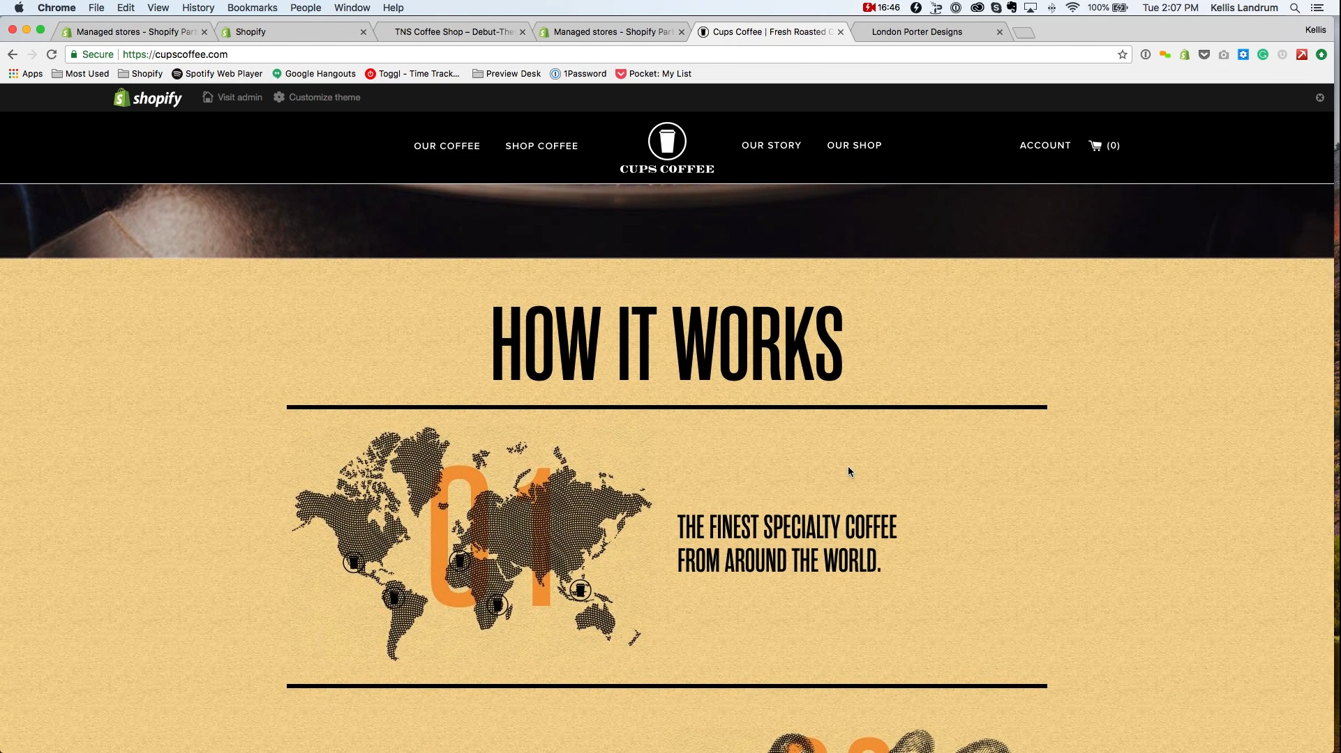
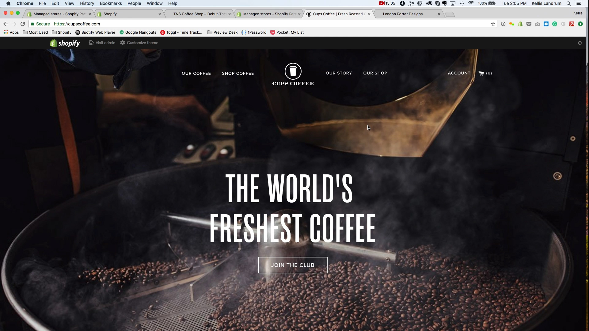
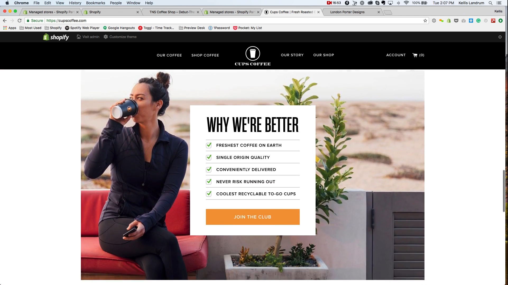
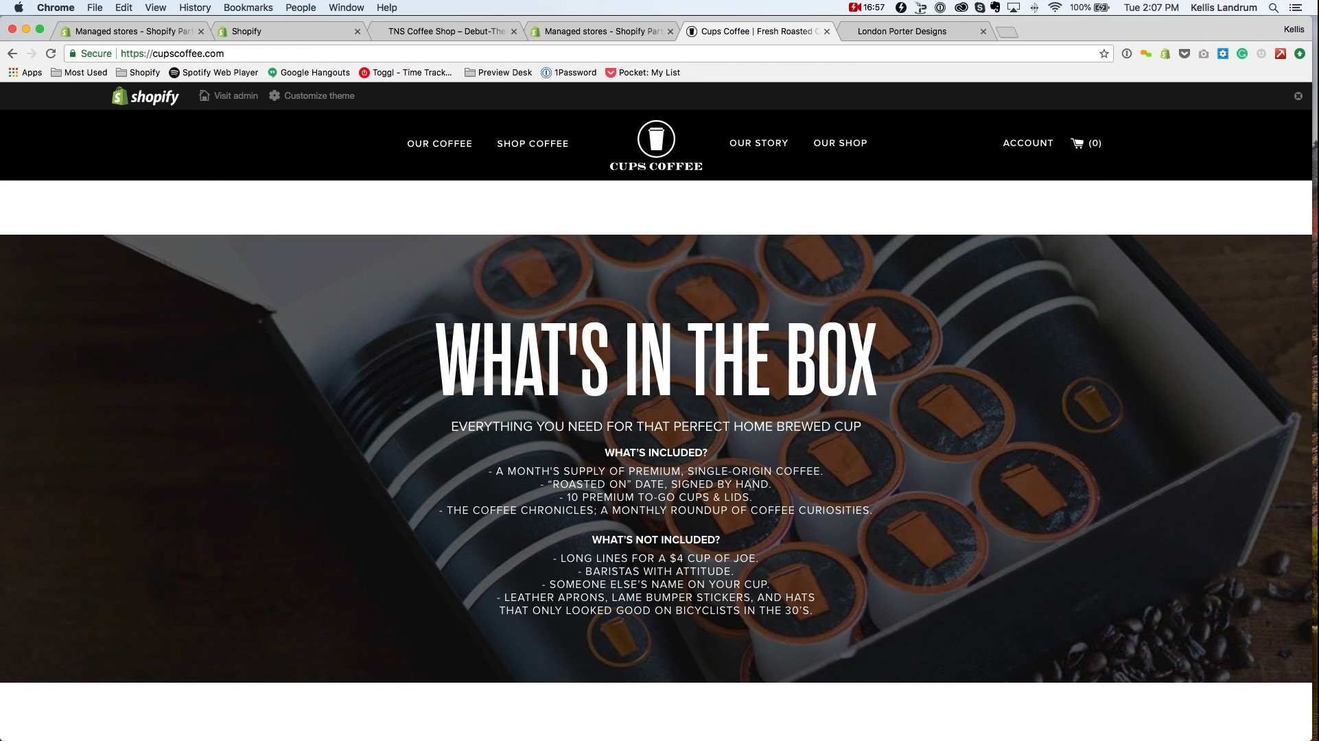
Okay so that’s a good little bit about merchandising. Let’s talk about homepage structure. I am going to jump over to another site here. This is a site we did for Cups Coffee. They sell fresh roasted coffee subscriptions. But regardless of the type of product that they are selling, the structure of their homepage is pretty much the same as any other ecommerce website. Almost every ecommerce website is designed the same way as far as the homepage goes. In fact the general structure of them are pretty much all the same. The homepage of any eccomerce website is built in blocks. So let’s look at what those blocks are. Almost every online store you’re going to see has a banner at the top of the page. Don’t be fooled by the banner at the top of the homepage runs to all four edges. This one, the world’s freshest coffee. We got a big picture of a coffee roaster. And it touches one, two, three, four edges as opposed to London Porter, which touches no edges.It’s free floating so to speak. Both have the header at the top. But for Cups Coffee, the header sits on top of the homepage banner on the homepage. So the homepage banner is at the top. This is usually the first block of any ecommerce website. As we scroll down we will see more blocks. This one has how it works. You can see a couple of steps to how it works, then our next block is, why we’re better. Our next block is, what’s int he box. Our next block is try a sample, then we hit the footer.
This website is very purposely structure this way. We can see a similar block layout setup with London Porter. We have once again the homepage banner at the top, this block with the four collection tiles. We got another block that has the gift box options. We got another block with featured gifts. We’ve got yet another block with just pictures. Now this is what you want to think about when you’re designing a homepage in terms of structure. When you’re thinking about, okay my ecommerce website is going to have some content on the homepage, what is that content going to be? Okay so there is some very standard choices for this. These two examples show a couple of them. Banner I would say is the slam dunk, you’re going to have a banner, you just are. I would say a very common choice after that would be collection links. Sending people to a specific collection of products to buy. If you’re selling kitchen ware it could be pots and pans, it could be some food gifts, it could be I don’t know, spoons and spatulas, that kind of thing. Apparel like aprons. Couple of different collections of your products. Featured products I think I mentioned. We generally recommend branded text, or explained text. We did a big sections on Cups Coffee just very quickly explaining people how it works. They get the finest specialty coffee from around the world, they hand roast it in small batches, they deliver it right to your door step, then they– and they give your premium to go cups and lids with every delivery. Very simple explanation, a lot of times these are text. You could just have a sentence or two. About what it is your store does or is about, what your store exists. In this case we wrote four sentences and we put some pictures next to them. That’s all this really is when you get down to it. We designed it to look really nice, but in the end it’s one, two, three, four. Remember what I said about not giving people a whole lot of stuff to read, right? We didn’t want to have four sentences. So we took those four sentences and broke them up into four pieces. Now instead of having a paragraph, you just have four quick bits to read. So that’s great strategy.
I think when we launched this site it had a video right in here, we have since removed that video, because I think it was out of date. These guys wanted to include some information about why their product is great, right? We did a custom version of this, but you can do a version of this– this is really just bullet points. This is headline and this is some bullet points. We designed it a little bit and put a picture behind it. There is a call to action, join the club, right? We did– this is essentially the same deal, it’s a headline, what’s in the box, then a lot of bullet pointed information, right? If you’re interested in what’s in the box, we have at least communicated to you like hey we will tell you, now if you want to take a few minutes to read then great, right? And of course try a sample, right? This is just an incentive. You could essentially think of this as as a single product to buy, right?
So just to quickly reiterate, very common example of blocks is– blocks you would include is a banner, a set of collections, set of feature products, some text about your brand or store, whatever it’s about, maybe a video, any kind of lifestyle photography you want to include. Some story orientation. I don’t think these two particular sites include an Instagram feed. But we have done that for quite a few stores, a very common thing. In fact most store templates include that now. So these are all very common examples of blocks, right? One night thing to think of when you’re thinking about your homepage blocks is they are going to look slightly differently, they are going to look slightly different I should say on mobile than they do on desktop. Let’s have a look at how London Porter looks on the desktop version versus mobile. I am going to pull this in a little bit, and I am going to open another copy of it in a new window. I am going to do a little bit of trickery through my browser to show the mobile version of this, or should I say an approximation of the mobile version, right? So I want to point out something we did with this side in particular that is a little bit tricky and a little bit sneaky, by very effective. Pull this down just a little bit so you can see, right? So on the desktop version the homepage banner is very wide, right? One of the issues we have ran into when designing sites is when you make a homepage banner that’s very wide– when you look at this banner on a mobile device it shrink down and it is still the same width, but it’s not very tall, right? So what we did was we created something in admin that allows this site to allows you to upload a separately designed version of the homepage banner in a different format, right? When someone goes this website on their desktop computer, it pulls this version of the image which is wide and looks great. When they go to the mobile version for the site, it pulls this horizontally designed version of the banner. So it fills up the space, the text is easier to read and it is just a better overall user experience. This is customized, but there are a few newer out of the box themes that Shopify or Magento that are available, they are just themes you can buy off of [00:24:36.22 – inaudible] one of those other sites that sells themes. Some of the newer themes have an option in the admin to do this. But– we have adopted this as best practice, just because when things get small and hard to read you are less likely to pay attention to them. So this is not a bad idea to do.
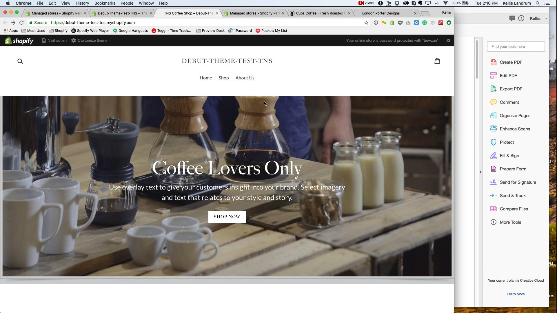
Let’s see, what else? In terms of homepage blocks most themes, most I should say– most themes that are not built custom, most out of the box themes on either Shopify or Magento or Woo-commerce; they will give you a little bit of flexibility in creating blocks. I am going to show you the Shopify version of this with a test store we set up. This is used the Debut theme. If you Google Shopify themes you will find the list of free and sometimes paid Shopify themes that Shopify recommends. This is Debut, right? We have done a little bit of set up to this, we have got some banners, added a couple of products, little bit of coffee. But I want to show you this so we can compare the front end and the back end of this theme, right? So like any ecommerce website we have a header here with the logo and the menu and all that kind of jazz then we have a footer. In-between we have the homepage and this has a banner at the top of the homepage. This has some what I call branded text. This is another block, then it has a featured product, a single one, which is another block. This is another slide show or gallery, however you want to think about this. We have one slide in here I think we need to add another. But this is another block. We have a block that is just a picture with some text next to it. This is a block that is available with this theme. Then we have a featured collection that shows off a few products that belong in this collection and then another slide show, then the footer, right?
So let’s take a look at what this theme looks like through the administrative controls, right? So this is the back office, this is the Shopify admin for this Debut test theme here, right? This is the default when you come in. So if I want to mess with the theme, I click on themes here and it is going to show me this is the them you are using, I am going to click on customize. You will see over there this actually shows me all of the blocks that are on my homepage, I can even add more blocks if I want to. It is even showing me a preview over here. Magento and Woo-commerce work a little bit differently, but I think– in terms of showing you a preview I think a lot of themes fro Woo-commerce and Magento work almost the same as this conceptually. They show you the list of blocks, if you say–let’s say if you wanted to switch the order of these two blocks, this is [00:28:21.17 – inaudible] and French Press, just going to drag and drop and re-order them. French Press is above– oh no I want to take my featured collection here and put it just below the French Press, I can drag and drop it pretty easy. Let’s say– actually I want to– you know what? This is too many products to show. Let’s– actually before we do that, let’s take a look at the banner here. So I am going to click on this banner, it’s showing me a picture, right? I can change it, I can remove it. This allows me to upload something from my desktop. I can set the text on top of here if I want to. I can do whatever I want. Now just as a note, a rule of thumb; if you want, you can show, you can add text through this admin and it will display it as HTML. Shopify will even give you– it has these controls up here that it will show you what it’s going to look like on a mobile versus desktop, right? Now one of the things you will notice is that it automatically crops this picture, right? Here this picture, the top of the picture is at the filter, we are seeing the edge of this coffee pot it looks like. When I click on the mobile version, now it shows me a completely different cropping, right? Now I’m seeing the top– the top of the picture was at the top of this coffee filter here, now it is all the way up to this person’s chest. That coffee pot that was on the left side is completely cropped out, right? Now this can become a real problem with photography. It depends on what you’re shooting. If you had a picture on a homepage and your product was over here on the left, let’s say– you can change, we can change the surround, but let’s say you had a pair of sunglasses here on the left, and you wanted to have text over here in the middle. If you on a mobile device, whatever is over here is going to get cropped out, right? This becomes even more problematic, say you have a picture of someone wearing sunglasses. You kind of have to have this person in the middle, because the middle is the only thing here that doesn’t get cropped off when we go to the mobile version, right? Whatever is in the middle of the picture here is good, whatever is on the sides of it you are probably going to lose, right? Say you had a person’s head framing this mobile version, well now when you go to the desktop version it is probably going to crop around their nose or mouth, right? We have seen this happen quite a bit. We also have text running over someone’s face if their face is in the middle. You know– you end up having to put their face in the middle, because the sides of this thing gets cropped off. It’s a real pain the butt so. One of the things– one way we found to solve this problem is to use these different version, using two different versions, right? One for mobile, and one for desktop. The other thing we sometimes recommend is instead of using HTML text on top of here, if you have Photoshop or if you are creating graphics in Photoshop, to put all of the text in the image as part of the graphic, right? And just– you can literally remove this text and it disappears. Now you will just see whatever is in there, right? You can figure out how to get rid of the shop now button, but if you have all the text in your image, then maybe you can get round this issue without your text, and going in weird places on your picture. So that’s just something to note with your homepage banner. Reload this, because that definitely gets a little tricky.
But let’s say I want to add a new section, I can. At least in this theme it will give me a list of new stuff, I can add a gallery, I could add a logo list, I could add a slide show. Let’s say I wanted to add a newsletter sign up, I got a form for that, I want to add that to my site. So I hit add, yes I do, I can change the text in here, show the background. For this kind of thing you would need to connect your MailChimp account, or e-mail service account, but you get the idea. You can set this thing in here. You could say, oh I want to re-order it, I want to move it up and down the page. Actually no I’m going to get rid of it, just remove it.
So that’s sort of the basic ideas. Now you have an idea of how these homepage blocks work, here is what I would recommend as a strategy. Plan first, right? Rather than going in here and saying, oh I am going to arrange a bunch of blocks, right? What we do is wireframing. This is a wireframe we created for Cups Coffee. You don’t have to do this in Illustrator or any kind of computer program, you can do this with pencil and paper just fine, right? But this is– it’s much faster to think about okay, what do I want on the homepage? Just sketching it out first, then try and work on all the little details, right? So we had a discussion with this client about what do we want to include on the homepage of Cups Coffee. So we presented some ideas to them, and got their feedback. But it is as simple as this, right? There is a banner up on the homepage, it is going to have some text on it, and a button to joint the club. We don’t know what this text is going to say yet, right? But we know we are going to have a picture and some text. We don’t know what that picture is yet, we don’t know what the messaging is yet. But what we want to do is convince people to sign up for a subscription, right? That is the entire purpose of this. Purpose is more important than specific content at this phase, right?
Next thing we wanted to do is explain how it works to somebody, right? This is another block. As I mentioned before. We said, we want to explain to people that we are going to source the highest quality. Originally we decided to have some more details in here. We ended up removing those later on, right? But we are going to have a sentence, a picture, some text, a sentence, some picture, some text. This was sort of the general idea that we wanted to get. By the way, I didn’t invent this layout. This is very common to a lot of sites. So you can look at other sites, look at what types of blocks do they have on their homepage, what is the general layout they are using. You can start thinking about, okay we can break it up into four pieces, we are going to have– each of those four pieces is going to have a headline. We want to create some art to go with each of those things, and create a little bit more detailed explanation. If someone want’s to know more about this they can; but they don’t have too, right? We lay this out, originally they shot a video. We said, okay we know this is going to go in here. We want to include what’s in the box. This is probably going to sit in a picture, or on top of a picture, right? Bullet pointed list of why we’re better. We originally just wrote this list out as a series of bullet points, right? Then we talked about– okay we can dress it up a little bit more, right? But this is why I say start with the idea first. Start with the need, so you don’t get too caught up in form, right? Oh okay we can have a block here that does this, that has room for this thing or that thing. Because there is a lot of different forms that a need can take, right? Try a sample, these are all real simple ideas, and a lot of times I start out just kind of sketching this out on a piece of paper, and the next step because I have clients and I want to look more professional, I go into Illustrator and make these, right? Take a look at something, talk about it, agree on it. Generally some organizations there is just one person making decisions about their ecommerce website. For a lot of companies there might be two or three of you that need to have a discussion, and need to discuss what can we do? Instead of needling and tweaking on building this stuff, I highly recommend just drawing something out, right? Even taking a couple of pieces of paper and making one block, then making another block, and thinking about, oh you know maybe the video should go underneath what’s in a box, right? As you start to have these discussions internally, a lot of ideas come out, you can bounce them off each other, and you can re-arrange things. You can re-order things, think a little bit about, okay if I want to tell people what’s in the box, should I have it sit on top of a picture? Oh should I have a picture next to some text? But the important thing is that you can do this, right? This is the idea we are getting down and we are discussing it.
Anyway, once again my name is Kellis Landrum, I am at True North Social, if you need any help with your ecommerce website we are happy to help, give us a call, shoot us an email. If you are just looking to get a better idea I hope this helps, have a great day.
Check out all of our posts in the Ecommerce Website Design series:
E-commerce Website Design: Series Overview
https://truenorthsocial.com/ecommerce-website-design/ecommerce-website-series-overview/
E-commerce Headers and Footers – The most underrated piece of your Online Store
https://truenorthsocial.com/ecommerce-website-design/e-commerce-headers-footers-the-most-under-rated-piece-of-your-online-store/
Homepage Banner Best Practices for Shopify Online Stores
https://truenorthsocial.com/ecommerce-website-design/homepage-banner-best-practices-shopify-online-stores/
How to make a great homepage for your E-commerce Website
https://truenorthsocial.com/ecommerce-website-design/how-to-make-a-great-homepage-for-your-ecommerce-website/
What you need to know about your E-commerce Shopping Cart Page
https://truenorthsocial.com/ecommerce-website-design/what-you-need-to-know-about-your-e-commerce-shopping-cart-page/
How To Create New Products in Shopify – Video Tutorial
https://truenorthsocial.com/ecommerce-website-design/create-new-products-shopify-video-tutorial/
How To Create Collections in Shopify – Video Tutorial
https://truenorthsocial.com/ecommerce-website-design/create-collections-shopify-video-tutorial/
How To Create New Pages in Shopify – Video Tutorial
https://truenorthsocial.com/ecommerce-website-design/create-new-pages-shopify/