 Skip to content
Hey there, this is Kellis Landrum at True North Social. We are a digital marketing agency based in Los Angeles California. We are also Shopify Experts specializing in marketing and web design for online stores. We do quite a bit of custom development on Shopify stores for a lot of different merchants and a lot of different industries. On a regular basis, we do a lot of consulting work with our client to advise them on best practices for all the different aspects of E-commerce. Today, we are going to talk about homepage banner best practices.
We have found this to be a subject of particular interest to a lot of the clients that we work with. Because in a lot of cases, people think of the home page banner as the look of the site. When they picture their site in their minds eye, in a lot of cases the home page banner represents it. Sometimes, that is an accurate representation and sometimes it is not.
The main reason it might not be is because some stores might change their homepage banner every couple of days, maybe every week. I like to think that you can change your homepage banner at least every couple of months. Depending on what your marketing strategy is, you may not ever change it.
Regardless of how often you change it, the look and feel of your banner is going to influence the look of your site for a lot of people. The first time they come to your site, this is generally what they are going to see. Let’s talk about what makes a good homepage banner versus what makes a not so great one. We are going to split this into a couple of different subjects. The first one is…
#1 Homepage Banner Best Practices
Call to Action (CTA)
When you look at a website banner, we want to communicate something clearly that is an actionable item. In fact, with most homepage banners that we create, we put some sort of call to action button on them. It may not be a literal button, it may just look like a button. The entire image maybe clickable, it may all be a button. The button will give customers a call to action.
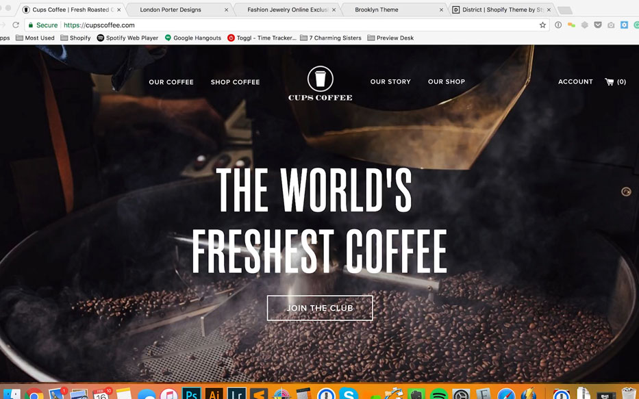
In this case (for Cups Coffee) We tell them that this is the words freshest coffee and join the club. Because, ‘Cups Coffee’ sells fresh roasted coffee on a subscription basis. Generally, as a merchandising strategy, what we want is give customers something very obvious to do. Think of this as- if you were running a retail store and somebody walks in and you talk to them and they say “so, what’s your thing, what do I buy, where is the place to start?”
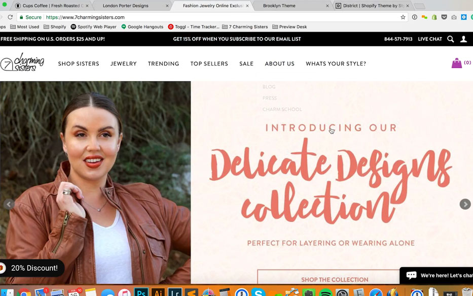
Your Call to Action may be- “join the club”, it may be “shop now”, it may take them to a collection or to a specific product. It could tell them something about a sale that is going on or some sort of marketing event. For ‘7 Charming Sisters’, we do this on regular basis. We still have the valentine day sale running. 20%, you can shop the collection; get it off with a code.
#2 Homepage Banner Best Practices
Lead Your Customer
Generally, when we talk to our clients about banners and what they should do. This will generally lead to a higher click through rate, as well as a better overall user experience. We recommend creating banners on the following:
A specific product
“buy this product, this is a hot selling product, this is our new product” anything that we want to push from a merchandising perspective. Maybe something that we want to clear out. Any specific product could be a potential banner.
A collection
Collections are a huge one. Any particular collection of products or services might be a good candidate for a banner.
A promotion
Anything that is event based: Valentine’s day, Free shipping, Buy One Get One 50% off. Get a certain percentage off with this code. These are all good things to communicate.
About Us
You can always do an ‘about us banner’ if you do not have anything specific running at the moment. If you want to run more than one banner at a time, like these loop through. You might have one banner that gives someone a call to action to click through to your about us web page and learn more about your company.
#3 Homepage Banner Best Practices
Art- Great imagery sells
When we talk homepage banner best practices let’s talk about art. Let’s look at ‘Cups Coffee’ again. As I mentioned, these guys do subscription to fresh roasted coffee. When you sign up for their subscription, they will bill you either once or twice a month and they will roast you coffee within three or four days of it being shipped to you. Personally, I tried it and I think that is fantastic. I cannot say enough about how great fresh roasted coffee is.
This banner immediately shows you an eye catching picture of coffee roasting and hopefully will inspire you to think about the smell of fresh roasted coffee. It works great for any type of food product. Generally, what we try to focus on is either showing people an experience of something (like fresh roasted coffee) or showing them a lifestyle. This is especially true for our fashion clients or clients that are selling accessories. Showing them the type of environment that this product or group of products might fit into. This often makes the difference between high quality banner and a lower quality one.
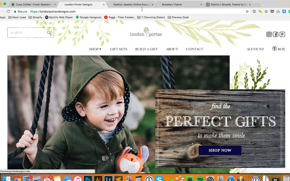
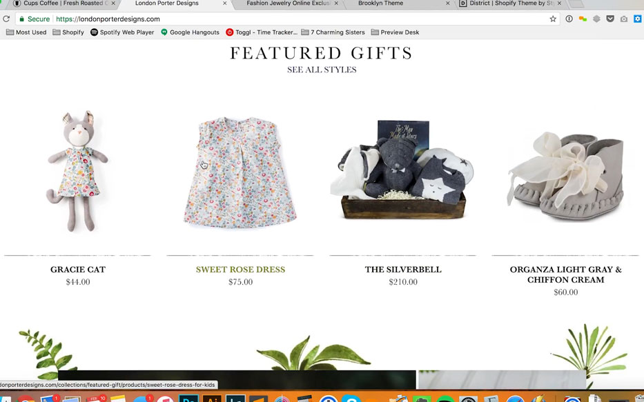
In the case of ‘London Porter’, they sell toys, clothing and gift baskets for children. They are showing happy, well-dressed children in a fun upscale environment. This was a really really important idea to create for the banner and the artwork for the site.
Showing the environment within which that product is used gives a customer context. It shows them where and how the product fits into their life. If you are showing people, you are showing the type of person that will use your product. Very often, customers are buying the idea of what they will look like with your product, as much as the product itself. This will really inform your customers on whether or not, this is the right type of product for them.
#4 Homepage Banner Best Practices
Tying into Marketing
If you are doing any sort of advertising or marketing, especially through Facebook ads, Instagram Story Ads, Banner Ads, or Display Ads, you create do very targeted campaigns. For example- with these types of products for kids we need to show the ads to moms. Facebook ads manager can get a tremendous amount of demographic information on a target audience. Generally, when people have kids, they post a lot of stuff on Facebook about it. Targeting moms is not hard. In this case, we want to target moms that want to buy presents for their kids or relatives; uncles, aunts, cousins. That sort of thing. We want to show them what a happy kid looks like with our product.
#5 Homepage Banner Best Practices
Getting Strategic
In this particular case, these gifts are fairly expensive. The quality of the products reflect this. The overall look and feel we have really been going for this site is as follows. When you give a gift to someone that is expensive, it shows that you have taste. The artwork for this site has been geared to reflect that you are giving a gift that is expensive. This shows how much you care for this person and their children.
These are the kinds of things that you can convey with a banner. A banner can go a long way in informing people about a product or a store without necessarily coming right out and saying “this is expensive” or “this is whatever it is.”
Finding the Right Environment
In this case, we added some typography of what this site is about in general. “Find the perfect gifts to make them smile.” These are gifts for children. Being able to tell your story with a banner is incredibly useful. We recommend that when you shoot photography for a banner, you shoot it in some sort of environment.
We talk with a lot of merchants who have shot their product on a white background for their product pages. Shooting products on a white background is very useful. That is a very standard way to show product on a store. Because it is very versatile, you can blend it in the back of a white page. It looks clean and nice and it shows you a great illustration of the product. But, it doesn’t show context. We want to use banners to show context for products. That context can be the environment in which it is shot. If you are shooting people. It can be the type of person that you are shooting.
Finding the Right Tone
One very underrated aspect of showing context is typography. This is actually one of the harder things to get right. Typography shows tone of voice. In a lot of cases, people communicate with each other. Vocal inflection says so much more than just words by themselves do. People communicate all the time with sounds that are not words like “hmm” it can indicate interest, it can indicate a question. The sound “hmm” can be used to communicate a dozen of things.
The stylization of your typography works in a very similar way to give people emotive queues as to what it is that you are trying to communicate. Is it masculine, feminine, hard or soft? Is it in your face or subtle. You can communicate quite a lot with typography.
Maybe you have the resources in-house to do this. Maybe you need to contract with somebody to shoot your photography in an environment or design banners with really great type and design involved in them. If you do not have those resources on hand, it is definitely worthwhile to find partners to work with. It might take a little time but it is definitely worth the investment.
Because we work with many merchants, we can say with a fair amount of confidence that nothing will help your product sell better than great photography and great design. It goes a long way in convincing people that your product is trustworthy and reliable and that you are somebody that they want to do business with. Having said that, art is a huge factor the last factor that we want to talk about is format.
#6 Homepage Banner Best Practices
Format
This is really easy to overlook, but as I start to point this out to you it becomes really obvious. Let us talk about homepage banner best practices for formatting banners. One of the very basic format issues that we deal with on a consistent basis is the number of edges a banner is going to touch.
Banners for Desktop
When I say this, I am referring to the desktop version of your site. On Cups Coffee, this banner touches all four edges of your browser. Meaning the top, right, bottom and left edges of your desktop edges. This is something we accommodate for; we assume that because it is hitting the top edge, this banner is going to go underneath our typography. If your type and logo are white, the picture underneath it has to be dark enough so that everything can be read clearly. Similarly, if you are using a very light picture, all the stuff here has to be dark.
What you have to watch out for is pictures that go light and dark across your navigation and cause things to disappear. This is an issue to watch out for and it can be tricky when you work with this type of banner. This can be a video banner as well. Just watch your file size as it can affect load time. No one likes a slow site.
Generally, this type of banner looks really nice when you do it right. But it is a little bit tricky to work with because you can run into legibility issues with your navigation. What are some ways we can work around that?
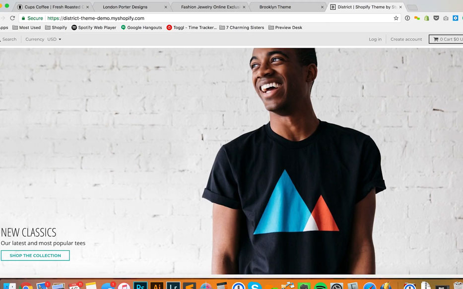
This is a theme from Shopify this is called District, what they did here is they have the banner running through to the left, right and bottom of the browser. But not the top. The top jut shows the header it cuts of the top of the banner but not too much. I am looking at this on a MacBook Pro. This is not a very tall browser width as compared to most monitors.
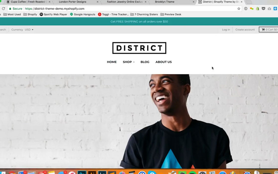
There is an issue with this format as well that we run into constantly. The format for this banner is very wide. When I say that what I mean is that the ratio of width to height. It is about twice as wide as it is tall. This is probably 4×2 in terms of the width to height. If you think of this as blocks, this will be 4 across and 2 tall. Cameras do not shoot at this aspect ratio. You might be able to take a panoramic photo on your iPhone.
But if you are shooting people, that is not going to work. Usually, what you do for this format is you take a picture and you crop some off at the top and you crop some off at the bottom. You see what’s happened in this case, they cropped off the top of this persons head. That is not an ideal way to shoot photography for banners. We like showing somebody with some space above their head to their waist down.
Most 35mm oriented camera’s will shoot in a 2:3 ratio whereas this banner is 2:4. It makes quite a bit of a difference. It is very wide as opposed to tall. A lot of monitors will stretch out a bit wider than this. The more you stretch out the banner, the more it will crop off the bottom, it will start to come up to the top of this triangle and maybe to the top of the shoulders. It will crop off more and more of this. It means that if you put type at the bottom of this banner it will be cut off.
These days’ people will scroll, that is not so much of an issue. There are certain themes that automatically crop this stuff. The wider the banner is, the more they will crop off the top and the bottom. This is not an ideal way to set things up from our experience. What we like working with is this first one I showed you, where all it touches all the edges of the browser or you run it in a way where you have space at the top, left and right side. Having the bottom edge cropped off here.
This is a little bit tricky because everyone has a different sized monitor. They are not going to be able to control where the bottom of their browser is. An individual can take the bottom of their browser and drag it around. Some people will make their browser smaller than their actual monitor. That is not something that we can control but we can account for it.
If we are looking at this, we generally like to work with a banner image that has a little bit of space on the sides or runs to all four edges. When building custom themes such as cups coffee, we can actually measure the size of the browser and have it automatically center some things to the top and bottom height.
When the page loads in, it will force some of these things to the center of the screen. Some out of the box free themes on ‘shopify’ will do that and some will not, it depends on which one you are working with. Just keep in mind that if you have a good ‘shopify’ partner. Your partner can work with the code to make it do any of these things. It shouldn’t be much of an issue for someone who knows how to work with ‘shopify’ themes. When you are thinking of how to set up your site and you are thinking of banners. The first thing you have to figure out is, how many edges of the browser do I want it to touch, that is something to consider.
Banners for Mobile
The next thing you probably want to consider very closely is how your banners are going to format themselves between desktop and mobile. This is a bigger and bigger issue all the time. One of the main issues we deal with all the time is, we built ‘7 charming sisters’ several years ago when mobile was less of a concern for this particular merchant. They did not have the resources to do separate banners of accommodate around that. When you drag it in, the site is responsive but these banners do not reformat. When you look at it on the phone, this banner is very short. This is an issue because the typography becomes smaller and it becomes much harder to read.
How do you deal with that? Our favorite way is we design our banner in two different formats. This is not feasible for every merchant but it is feasible for quite a few of them. If you are working with your own original assets especially. We created a wide banner for the desktop version. We also created a tall narrow banner. If you pull this site up on a mobile device, I guarantee that it works for you.
Responsiveness for mobile devices on desktop is a little bit iffy. You can see it with this site, we have a tall banner for the mobile version, when it hits a certain length, and it goes back to the desktop version. In between width, this is what you look at on iPad. If you look at the orientation that you have your iPad set up with, if it is tall or wide. Generally, we like to use a different tall format so that we can deal with this. For our merchants, almost all of them at least 50% of their traffic is coming in through a mobile device. This is what we call ‘mobile-optimized experience’.
We have something in the admin that will allow us to set a separate banner for the mobile device and the browser will detect which one to use depending on if you are looking at it on a phone or on a desktop. We like to create a tall banner for mobile devices. Some of our merchants get 70% of their traffic through a mobile device. This is a huge thing to account for. There are a lot of different ways to solve this but it is very tricky. This is the Brooklyn theme from ‘shopify’ generally, this is one of the most popular out of the box themes that we have worked with.
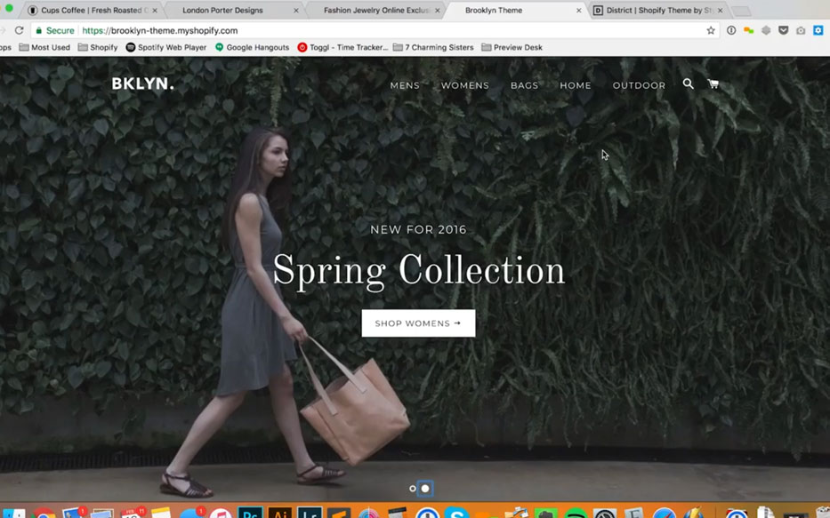
A lot of merchants come to us and say “we want to do a store set up, we really love Brooklyn, that is our theme.” We’re okay with this but we tweak it so we can use separate banners for desktop and mobile. Here is why. The way that this banner is set up. This text is HTML and it is always centered. Shopify has included banners in the demo of this theme that work fairly well with that. The picture of this guy. Generally, we do not like to run type across the face of a model. It works well enough in this picture, it is especially awkward if you run type over someone’s eyes.
In this particular theme, the typography is centered. You cannot put it right or left, it is just centered. This is because as you drag in, it squishes the left and right edges of this picture. As you drag it out, it crops of the top and the bottom of this picture. If you are working with this picture where you start cropping off too much of the top or the bottom, you might crop off somebody’s eyes which looks really awkward.
I have seen this happen with a lot of clients that have come to us, looking for a redesign. They have a model who goes to the top and the bottom and as the picture gets pulled out wider, it crops off the person’s head and the bottom of their shoes. You really want to watch out for that.
As you, drag this in to the size of your mobile device. This picture works because the person is in the center of this picture. But, if you have the person on the left or the right of the picture, it would not. As you pull inwards, it crops off this side, so you see bush here, as you pull down to a mobile device size. It just disappears. If you have a person on the side of this banner to the left and the right instead of the center. They will disappear as well.
With this girl, half of her gets cropped off. On the desktop version, we can see her shoes. If this company was selling shoes that might be a problem because you are cropping off one half of the product. This all of a sudden becomes an issue for a lot of merchants.
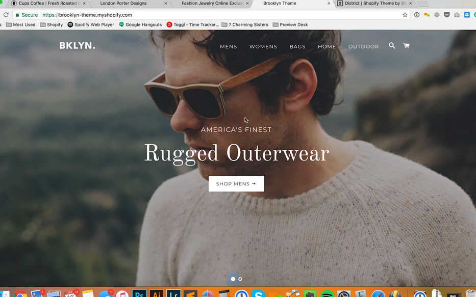
So this is one way to handle homepage banners, this is not one of our favorites. It requires you to shoot in a very specific way. It requires you to put your product or content towards the middle of this banner and then run typography across it. That can be problematic.
Our favorite way to deal with this is to have a picture on the left and then put type on the right. When you go to the mobile banner size, you call it a different banner and design the design the banner with a picture on top and the type above or below. It is a very common way we handle these problems.
Banners, and More Banners
These are some issues to think about when considering homepage banner best practices. One last thing, when people think of banners, they generally think of banners being at the top of their homepage. Usually they are, but not just at the top of their homepage. For a lot of merchants, we have more banners down the page. Like this one that talks about thoughtfully curated gift boxes. You can include more than one banner on the page. You can put a banner on your collection page. Some of these banners may change. These banners may change on a daily basis, maybe they do and maybe they do not. Banners can be used over and over again to talk about different things. They can push people to different kinds of products.
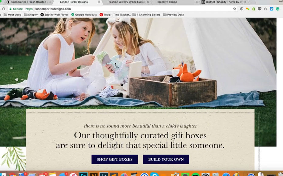
This one, in particular, shows a picture of kids pulling things out of a gift box. That is because this company sells pre-built gift boxes. They also offer you the ability to create your own gift box. There a lot of things you can do with banners. You can use them to educate people about products. You can use them to educate people about your company. For Cups Coffee, we created this banner that says “why we’re better” and just lists a series of bullet points about why their product is better than your average product and this can re-format to a mobile device. These are all things to think about. There are all sorts of different ways that you can use banners.
Really, you have to think about “what am I trying to communicate?” “What am I trying to get people to do when I am showing people a banner? When I am creating the look and feel of it” what am I showing them” “how am I showing this product being used” “what am I telling people?” The format of the banners and making sure you do not run into issues with devices, display and that your photography can work with whatever banner that you choose.
That is it for today. Once again, my name is Kellis Landrum. I am an owner here at True North Social; we are a digital marketing agency in Los Angeles. We specialize in ecommerce website design and development. I hope you have learned a little bit today about homepage banner best practices on your store. Thanks
Check out all of our posts in the Ecommerce Website Design series:
E-commerce Website Design: Series Overview
https://truenorthsocial.com/ecommerce-website-design/ecommerce-website-series-overview/
E-commerce Headers and Footers – The most underrated piece of your Online Store
https://truenorthsocial.com/ecommerce-website-design/e-commerce-headers-footers-the-most-under-rated-piece-of-your-online-store/
Homepage Banner Best Practices for Shopify Online Stores
https://truenorthsocial.com/ecommerce-website-design/homepage-banner-best-practices-shopify-online-stores/
How to make a great homepage for your E-commerce Website
https://truenorthsocial.com/ecommerce-website-design/how-to-make-a-great-homepage-for-your-ecommerce-website/
What you need to know about your E-commerce Shopping Cart Page
https://truenorthsocial.com/ecommerce-website-design/what-you-need-to-know-about-your-e-commerce-shopping-cart-page/
How To Create New Products in Shopify – Video Tutorial
https://truenorthsocial.com/ecommerce-website-design/create-new-products-shopify-video-tutorial/
How To Create Collections in Shopify – Video Tutorial
https://truenorthsocial.com/ecommerce-website-design/create-collections-shopify-video-tutorial/
How To Create New Pages in Shopify – Video Tutorial
https://truenorthsocial.com/ecommerce-website-design/create-new-pages-shopify/