Hey there, this is Kellis Landrum from True North Social. We are continuing our video series on E-commerce website design. Today we are going to talk a little bit about e-commerce website headers and footers.
Whats in a header?
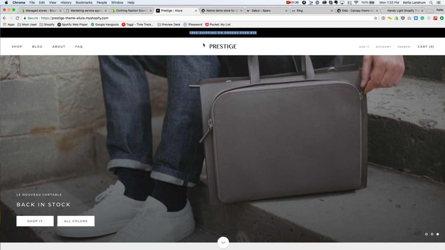
So let’s start looking at the header here. What exactly do we mean when we are talking about the header? So the header is usually a part of the website at the top of the page which is fixed. It is used for navigation. In this case, I am referring to this bar across the top that says, ‘Shipping on orders over $70’. The second bar beneath it that has the navigation on the left, it has the logo on the right, the cart and some other controls to the right of the logo.
This is the header. You are going to see a header on ever E-commerce website that you ever go to. It is a very standard format and allows people to understand how to navigate around an E-commerce website. In fact, every contemporary website has a header in it.
This store is a Shopify template. Shopify has controls set up for the header, as does ever E-commerce system, and basically every non-E-commerce system now. This is set up so Google can understand that this is what the header is. Almost every website will have a header of some sort.
Now part of the reason I want to discuss this, is there are different ways to style the header. Different things that can be in your header, but regardless of what you’re selling online, your site will have a header. The header and footer in my professional opinion are actually two of the most difficult things on any website to design, and there is a ton of branding involved in that. There is actually not a lot to e-commerce website headers and footers, which is probably what makes them tricky to design.
There are a few things that they usually consist of. Among those things they consist of, there are quite a few different ways to set them up. Your header and footer is on every page of your website, so getting them right can have a massive effect on your conversion rates.
So as I mentioned, this is the header. It’s this stuff. As I scroll down to the bottom of the page this is the footer. The footer is also at the end of every page. It is on just about every website you are going to see right now. Both e-commerce website headers and footers are going to have the same content across every page of your website. The format of them might change a little bit, but the content of them will not.
Now, what do I mean when I say that? Let’s look at this particular theme as an example. This header sits on top of a picture, so the header right here is clear, and it shows a picture beneath it. I mention this as a relevant thing because not every website has a picture sitting underneath the header here. This picture has to be dark enough that this type can be read in white.
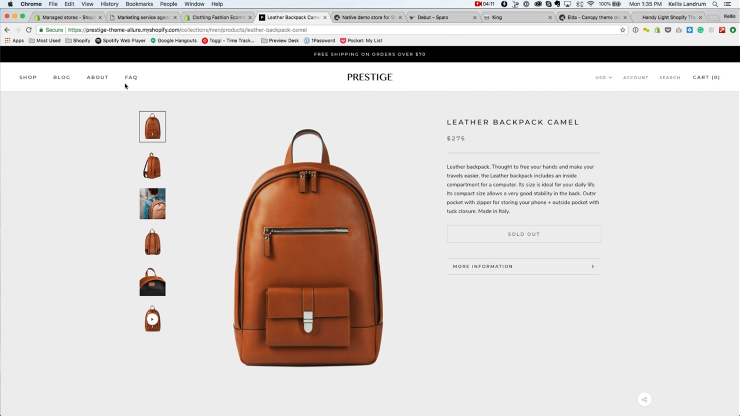
Now one thing I am going to do here is click to a product page. You will see that the color of the header here has changed. Previously this header bar was clear and the type was white when it was sitting on top of the photo.
Now it has changed to a white background with black type. But, the content that is in the header is still all exactly the same. It has the same four links, in the exact same place, has the logo in the same place and other additional controls in the same place. The content that is in this header bar has not changed, but the styling of it has.
You will see this happen in different ways across different websites. As I scroll down this page the header with the free shipping offer disappears, but this does not. This is a very conscious decision. If you are working with an out of box template, you are stuck with whatever the out of box template offers you.
But if you are doing a custom theme, if you are working with a development partner like True North Social, they can help you design and develop your own E-commerce theme. You can do whatever you want with it. You can think about what is the appropriate thing to do with my site for my particular products, and make an informed decision about what you want to do with this.
So this is an important distinction. If you don’t want to work with your agency partner and say, hey on some pages I want to include the cart, but on same pages, I don’t.
Generally, you want to keep what is in the header the same everywhere. But the way you have it styled may change around a little bit. There are some websites when you are at the top of the page the header might be a little bit bigger, but then it shrinks as you scroll down the page.
In fact, this one does if you count the fact that free shipping disappears. The vertical height of this changes as we scroll down the page. Also as we get further down the page the coloring of this changes. The style of youre-commerce website headers and footers might change a little, but the content will not.
Website navigation, menus, and sub menus
So that said, let’s see; let’s talk a little bit about what is in a header. Some of the common things that are in the header are main navigation. What is exactly the main navigation consists of might change around a little bit store to store.
Most E-commerce websites will include a collection may be called shop, or catalog or something. But it will contain at least one default collection, assuming you have more than one product. You need this to show people you have a bunch of different products.
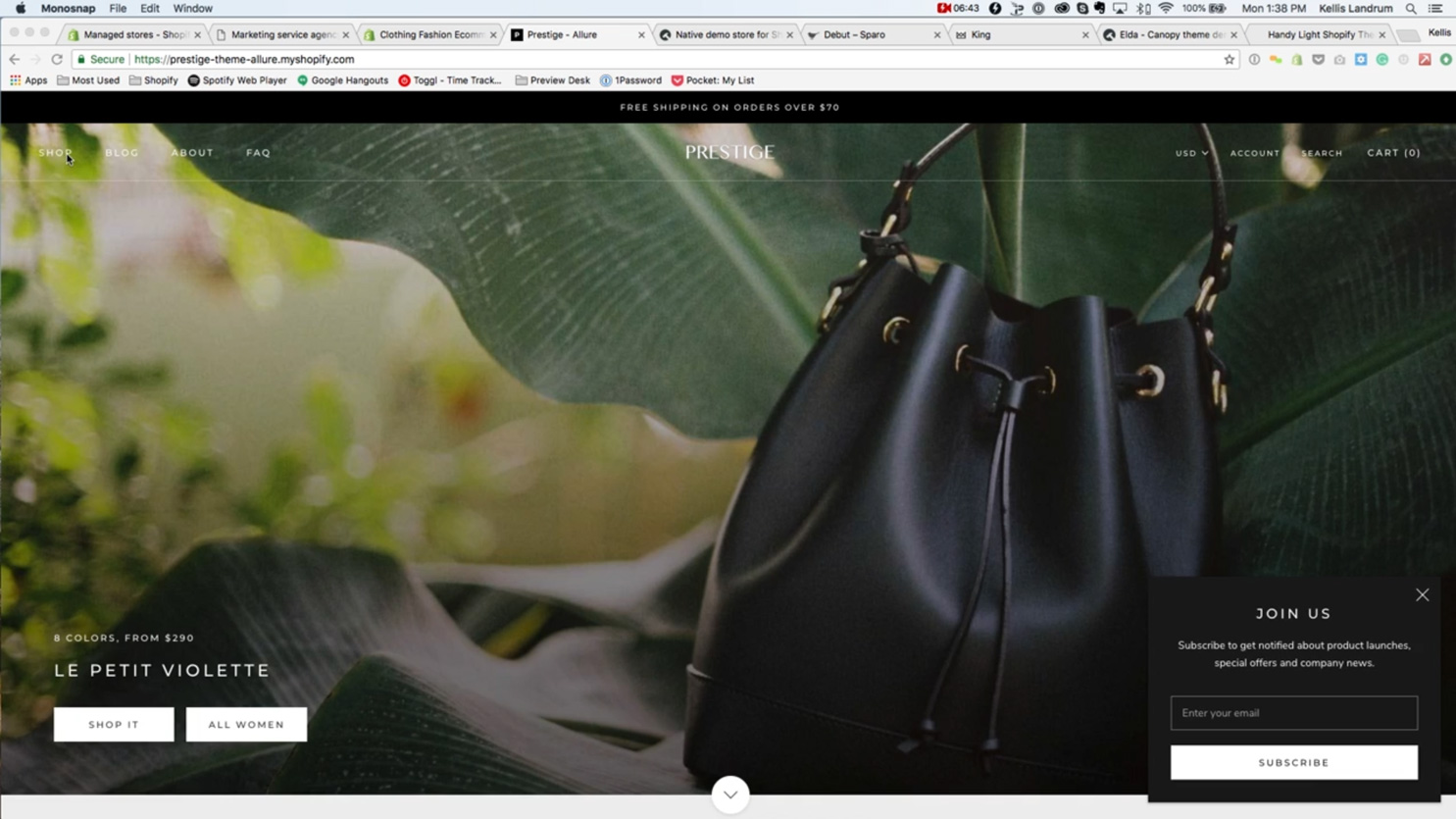
You may have sub-categories along with this. When you hover over these it may reveal sub-categorization of categories of products, different models, different colors, all sorts of different options you might have, but that is very common.
In addition, if you want to have a blog, if you want to have web pages about you, contact or anything like that; most E-commerce platforms will include the ability to create new pages and add them to your header, that’s generally pretty easy. But if you are wondering if you can include a page about legal stuff up here, or about something that is non-standard, the answer is generally yes, yes you can.
You can include anything you want in your header. The particular needs of it are up to you. You generally will include the logo. The general user experience that most E-commerce websites have is that when you click on the logo, you go back to the homepage. There is no law saying you have to do this, but because most E-commerce websites do this, most users will expect this to happen so it is a pretty good practice that I would generally recommend doing.
As you look at this theme going over to the right here, this theme includes the ability to switch the way currency is displayed. I recommend getting rid of this. This is false advertising in my opinion. Some themes will include this, some will not. But this does not change the currency of check out. If you are in Canada this will displace your pricing in Canadian dollars, but it will not conduct your check out process in Canadian dollars, or Euros or British pound sterling.
This is false advertising in my opinion. If you are going to offer customers– if you are going to have customers in different countries, you should work with a qualified partner to help you set up your website to do that. I would highly recommend removing this. That’s all I am going to say about this.
Your account is an important part of your Ecommerce website. If someone has bought from you before and they want to go view their information, account information, they can click on this, they can log in, they can generally see what they bought when they bought it.
They can if they want to if they have had an account with your store for a long time and want to change their e-mail address because they used to use Hotmail and now they use Gmail. They would log in to do this, you need that.
Site search is generally useful if you have a fairly large number of products if someone knows what they want and they want to go straight to it, it is pretty useful for that. If you only have a dozen products in your store, search is maybe not as useful, because there are just not that many products to search.

Cart is an essential function of your online store. Every E-commerce website needs to have a cart. I would generally recommend keeping it in the header in the right-hand corner is a good option, but again there is no law saying you have to have it there.
You can include lots of different things in your header- extra header bars; messaging saying free shipping over a certain amount; discounts $15 off with this discount code; the entire store is 20% off through Labor Day. These are very standard messages to include in your header bar. They could be in a bar, they might not be, that is dependent totally on styling. But these are some of the things to consider whether or not to put in your header from a content perspective.
Content is key
We at True North Social, we do a lot of custom theme design. The first thing we start with is wireframing where we define what content is included in a specific piece of website we want to design.
So in the header, we will talk to our clients and say, are you going to offer free shipping on your store? If they say yes we say do you want to include a message like that in the header? Some people, some websites will include more messaging in the top, some won’t, some will put stuff way up the top here. But the first thing we talk about is, what is the content that is going to be included in your header? So that is generally the place I recommend starting.
The same thing is true for the footer of the site. When you think about the footer design, you wanted to think about what content do you want to include in here. Do you want to include some information about your shop? If you have a physical location? Do you want to include a map, your phone number, or a contact form? Or your street address in here? Do you want to include your social channels? These could go in the header, the footer or both because they play an important role in the user experience of your store.
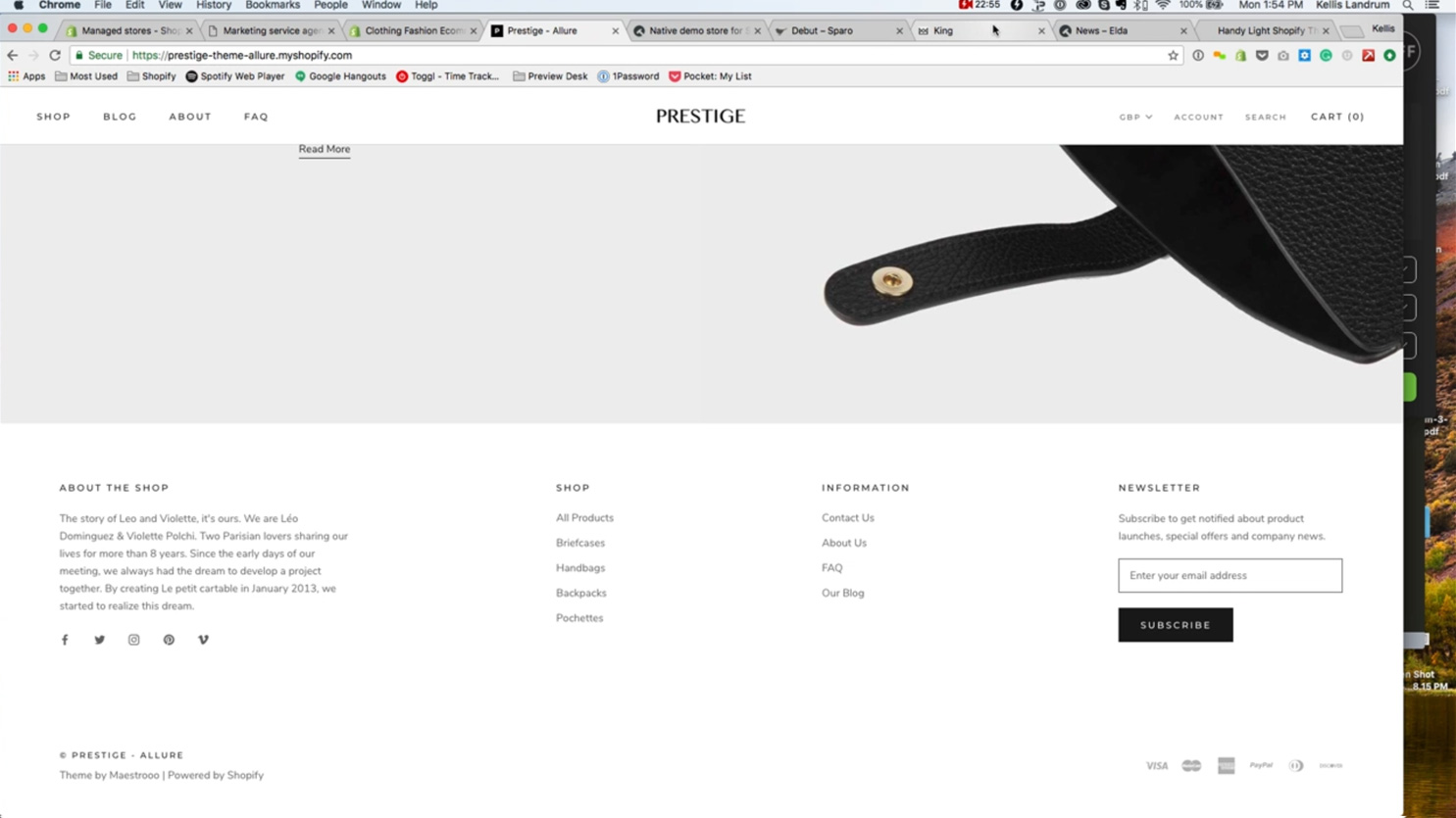
There is a set of links here. One of the things we generally recommend is you include some information about return policies. Anybody who buys from you is probably going to want to know if I want to return or exchange this product, how does that work? You can include whatever information you want in here, sign up for a newsletter, it’s pretty standard. A lot of out of the box templates include these payment methods. I am not sure why you want, or need to promote the American Express on your website; you can if you want to.
So think about content first when you are working withe-commerce website headers and footers. Why do I say that? Well because once you get past the content you want to include in your e-commerce website headers and footers, the next thing you want to think about is styling. There a ton of different ways to do styling for your e-commerce website headers and footers. I am going to show you a few examples that I have picked out here.
Let’s look at this one first. This one has two bars. It has one bar at the top in black with a free shipping message. Has another bar below it with a menu or logo and some additional controls. This has a clear background and on white. It has a picture sitting below it.
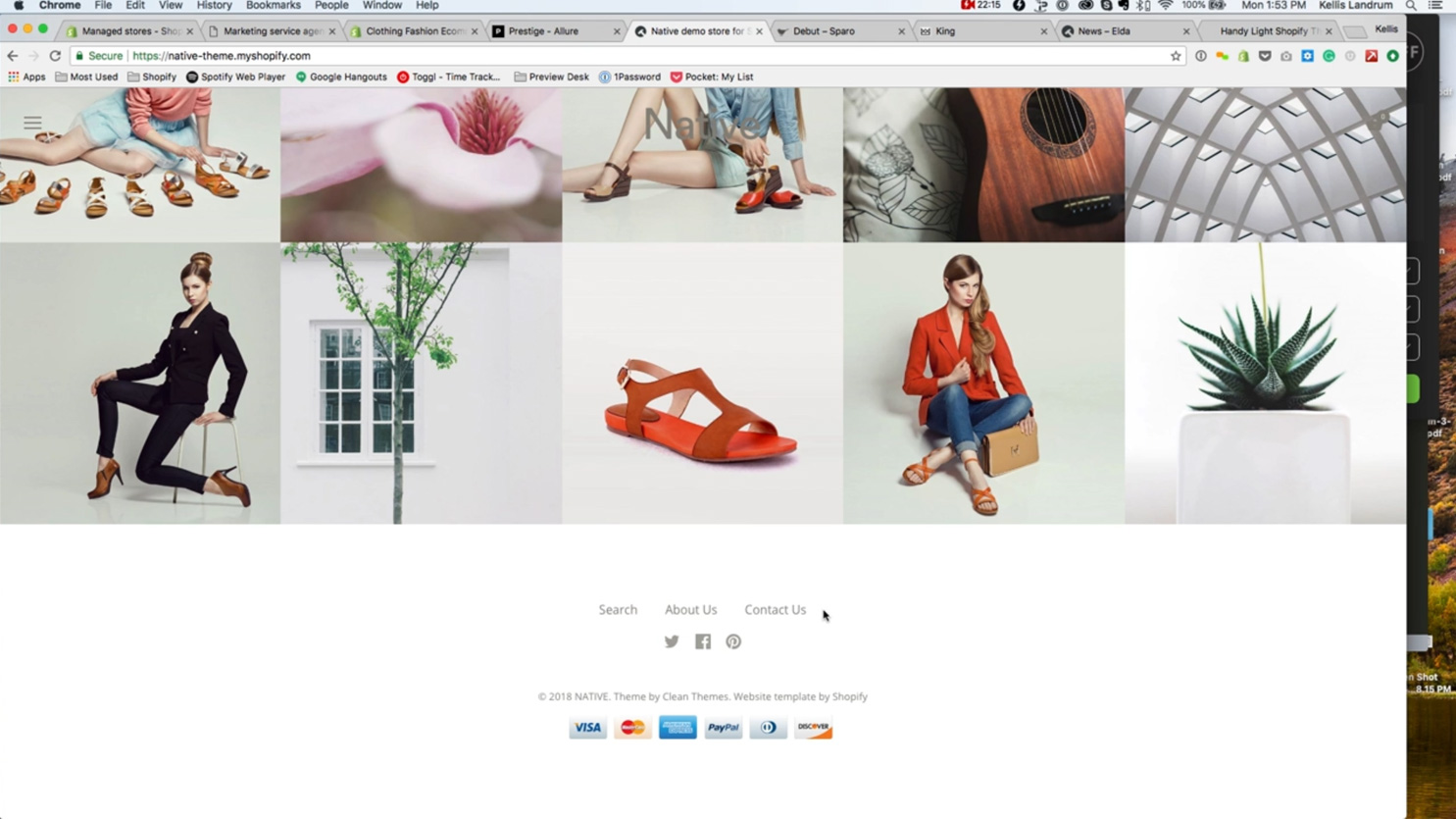
Let’s click over to this next example. Native, these are all Shopify themes that you-you can Google Shopify themes and find these on Shopify’s theme directory. Just using these as examples. Okay, so this has a picture sitting under the header. This does not have a clearly defined header bar. But it is still the header none of the less, even though the homepage banner is sitting underneath it. Just because it doesn’t necessarily look like a header, doesn’t mean it has stopped being the header, it very much is.
One of the clear differences between this theme and a lot of other themes is that the menu is stuck in what we refer to as a hamburger icon. It is very commonly referred to as this. When I click on this it shows me menu options. These might be the exact same menu options that are shown over here in this theme. Shop, blog, about. This has shop, news, and demos and search. They hide these by default.
Hamburger icons are generally used in mobile versions of themes. Some desktop versions of websites will have menu options in a hamburger menu. But I wanted to show you this because this doesn’t necessarily look like what we commonly think of as a header, it still is. So don’t be fooled.
Okay, let’s talk about different setups for the header. This one only has a single bar. But when a lot of people think of a website design, what they really picture in their mind is the homepage. So this homepage has the header in a bar, and it has a big photo beneath it. But the photo here touches the left and right edges of the browser, but it does not touch the top edge of the browser. There are maybe 100 pixels or so of room here for the header bar. So this is a bar design.
King here has a vertical header. This is a header; once again, don’t be fooled because the styling is a little bit different. They have it fixed to the left. But it is still a header none the less, it still has their logo, this is an account icon, a search icon, and a cart icon. Still has collections which are expandable. This looks like it sort of combines the header and the footer into one piece that is constantly available on the left-hand side. So once again, don’t be fooled.
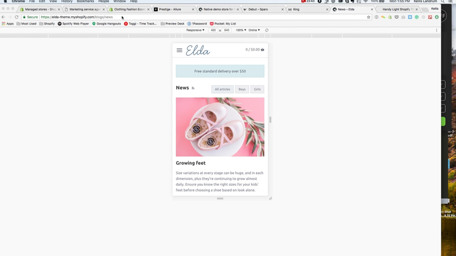
Okay, so this header is quite a bit taller. The banner down below here, log in, join and search is over on the left. We have some social icons in the header. These are sort of fixed to the top, our cart is here. This one displays the amount of goods that you have added to the cart. It has the logo centered and the menu beneath it.
Some of the other options have the logo on the left or the menu on the left. They have these things set up a little bit differently, but this is still a header none the less. The homepage banner below it doesn’t touch the left or right edges, it doesn’t touch the top. This header is quite a bit taller, but it is still a header none the less. This particular theme I am not sure is free standard delivery over $50 is part of the header or not.
How would we find something like that out? Good question, I am glad you asked. Let’s click around to a couple of other pages. It stays there and that is a strong indication that this is part of the header. In fact, I am going to make a judgment call and say this is part of the header, this messaging is just below the navigation, instead of stuck up to the top like this one.
These are all content elements that are contained within the header; they are just styled and arranged a little bit differently. So you are starting to get the idea that there are lots of different options.
Fixed vs fluid layout
Why did I pick this theme? Because this theme is within a fixed page column. As I grab the edge of this, all of this header stuff in here, it all just centers and this does not change at all. Some of these other ones, see they are fixed to a distance at the edge of the browser right here. There is probably 125, 150 pixels of padding in-between the cart and the edge of the browser here. When I drag it back and forth the space between here changes, it compacts, but the space on the edge of the browser doesn’t.
The elements can be fixed to the edge of the browser or not. Some of these other ones, this is fixed to the left edge of the browser. But the edge of this can expand and contract. These elements are fixed to the edge of the browser. These ones have a variable padding on either side so they can expand and contract.
So these are some things to think about with the styling of your header. The footer can or cannot or can in a very similar way. Even though this is centered and the padding here changes a little bit when I drag these back and forth, the padding in-between footer elements if generally the same all the way across the board. So one does not have to dictate the other.
All of this stuff is just stuck to the center. Whereas this it looks like the logo is centered and the elements are stuck to the sides. I think that is enough of that, you probably get the picture by now.
What’s in a footer?
Let’s see, okay. We talked a little bit about the header; let’s talk a little bit about the footer. Again, these can contain any elements you want. Let’s compare a few of these to see what different sites include in their footer. Or should I say lack thereof?
But let’s take a look. This one has some text about the store; generally have some links, a link to your newsletter. Some sites are a little bit more minimal. You might not have a lot of information in your footer. In fact, a lot of websites commonly don’t. Your footer could just be a couple of links like this.
Once again I would recommend you put return policy in your footer. I would recommend the minimum content you put in your footer is a link to a page with return policy information, a link to your contact page, because people may want to e-mail you if they have a question or want to do a return. Those are the links I would include. I would include links to your social channels because those are always valuable.
I would also recommend you have a link to a box for your e-mail sign up just like this. Encourage people to sign up for your e-mail list, because marketing to them later will be very useful. This is a very minimal footer, but don’t be fooled; that is a footer. Those are pretty common elements for a footer.
Now for e-commerce website headers and footers those are the basics. Let’s talk about the difference between e-commerce website headers and footers on mobile devices versus a desktop computer.
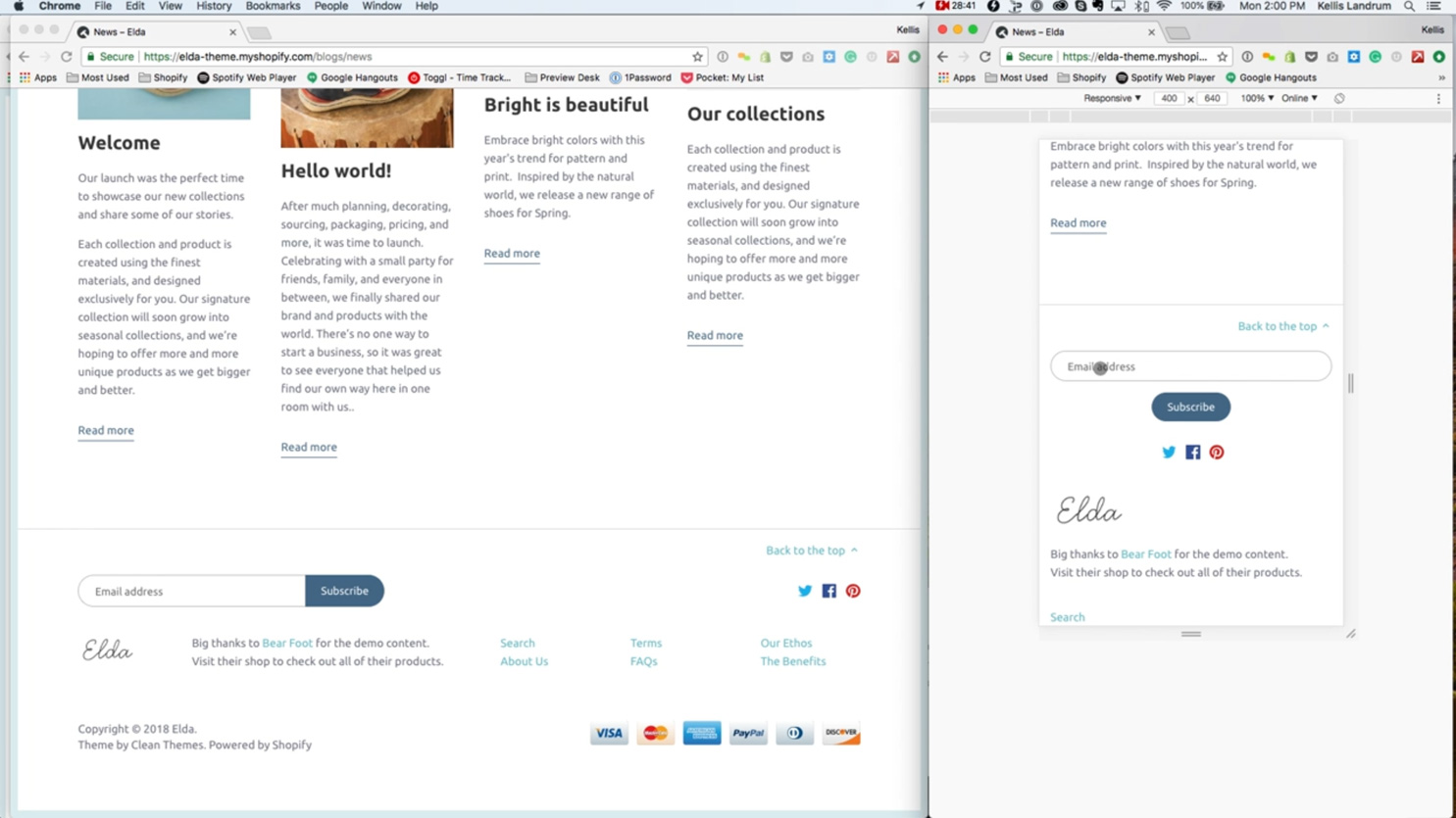
So this is what my footer looks like on the desktop version. I have a little tool here in Chrome that will give me a pretty good approximation of what this website looks like on mobile. Let’s do a side by side comparison of the desktop and the mobile version of this theme. On my right I have a mobile version, on the left I have the desktop version. What can we see or not see as we transition?
Generally, the mobile version of a header is going to be very compact. These are very standard elements that you will see on the mobile version of the header. You will have a hamburger icon that acts as a call to action to reveal your navigational menu. This is different, keep in mind that on a desktop website you have hover. On a mobile website, a mobile phone does not have a hover because there is no mouse. You can only tap. If you were using hover for an interaction, you have to find another way to deal with things because you have not hover state.
We have a hamburger icon on the left, we have the logo. This one is over to the left, most of them are centered; I like them centered. We have the cart on the right. This is a very common set up I think for a mobile version of a header. When I click on this there is an expanded state. Keep in mind this is only one way to style this. This shifts the main part of the website to the left and reveals the navigation. It is the same navigational content that is over here. This is just a different way to interact with it.
On my desktop version, I hover. But on the mobile version of my site, I need to tap this arrow to reveal more options that are within. With the desktop version of my site, it looks like there is a picture here, on mobile, there is not. On the desktop version, you may display links.
This particular theme makes you click to another list of links. Again, if you are working with an agency, you can design this any way you like. But if you are working with an out of the box theme or template, you are kind of stuck with whatever that template has until you work with a partner to design something custom for your E-commerce site. This is pretty typical of how these things work. I think the most common methods are the slide out to one side, or they will expand the list of menu and navigation options downward; those are both very common.
Let’s take a look at the footer. So the footer has all the same elements. It has the sign up for the newsletter, it has the social elements, it has the logo, has all the links, all the content. One thing additionally to note about templates, is most of these are not styled very nicely. It’s because templates are made of a very wide variety of E-commerce website needs, right? This could be used for a store that sells clothing, ketchup or juice bottles, car parts or whatever you want to sell.
The way this is designed is generally in my opinion- not great. It just lists all of these things straight down. They could be side by side; they might not be optimally sized for touch. A lot of times when I look at these E-commerce website templates, the links are very small so it is easy to accidentally tap on the wrong one if you have big fingers like I do. We do a lot of work with the styling of these things to what I would say create a better user experience with this stuff.
Another thing to note is generally websites are built are on the desktop, if you read these things left to right, one, two, three, four, five, six, seven, eight, nine, ten; they will stack in the same order. E-mail address subscribe is one, social tools are two, the logo is three, messaging is four, link set five, link set six, link set seven, copyright eight, payment logos nine. So this stacks everything in that order. There is one, two, three, four, five, six, seven, eight, nine. It’s the same order.
Now for this particular theme, I think it works well because the subscribe module is the first one. Our experience at True North Social, getting people to sign up for your newsletter is pretty important.
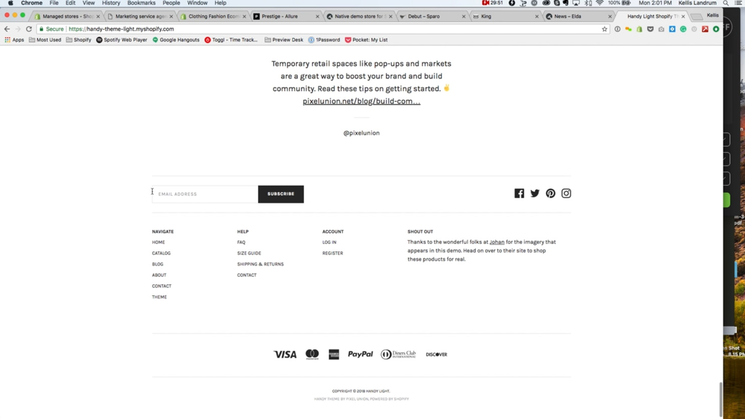
Let’s look at another theme and how it responds a little bit differently. This theme has the e-mail signup first. Some of these have it last, which I don’t think is best practice, or just not first. This has this list of links one, this has the e-mail sign up number two.
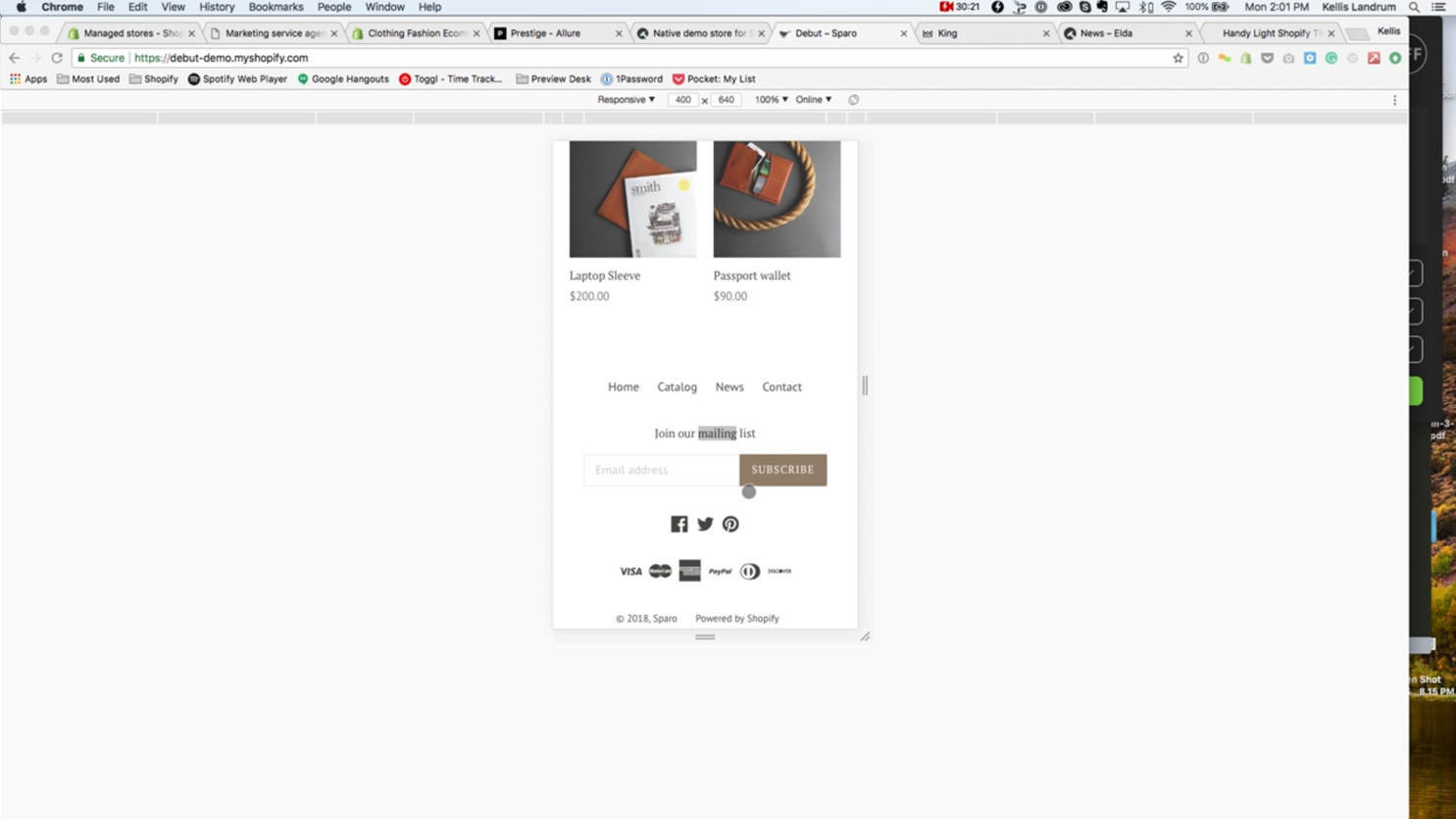
When we look at the website footer here, now this has a list of links one, subscribe two. If you had a lot of links or more than one list, it would push this progressively further down towards the end of the page where people might not notice it. This one does not have an e-mail sign up at all. This one has it way over on the end. Let’s take a look and see what this looks like on mobile.
This is where the footer starts with about shop, then it has my social links, all my links. Then way down here towards the bottom, it has sign up, almost at the very end. I would recommend putting this towards the beginning. Again, if you are working with us to create a custom theme for your Ecommerce website; we can do tricky stuff- we can have it display, we can have the content all be the same from the desktop version, to the mobile version.
It’s even possible create some tricks through CSS that would show this on the left, so down towards the end of the list on the desktop, then you go over to the mobile version, we can re-order them. But this is a custom thing. That would be theme customization for sure to do that. I am not aware of any out of the box templates that allow you to do that sort of thing.
I hope this is a good overview, a good breakdown of e-commerce website headers and footers. Once again, I go into a lot of detail about this, because they are the most challenging parts of web design. I say this because most people look at an online store design as the homepage banner and the photography. But assuming you have a good photographer shooting great photography of your products; that is not an issue. You can hire a good photographer and solve that problem completely. It will not solve problems with your e-commerce website headers and footers.
If your e-commerce website headers and footers are difficult to use or they don’t look good; they are on every single page of your website. So great photography will help your home page, but it will not help the e-commerce website headers and footers on your collection pages. It will not help thee-commerce website headers and footers on our about page, on any piece of your carts. Your e-commerce website headers and footers are so universal. They go across every page, they are going to be on the about page, they are going to be on the FAQ.
They really are a huge workhorse piece of branding for your site and they have a huge effect on website navigation, finding products (user experience), and conversion rates. Small sites don’t have a lot of pages. But bigger more established sites do. The longer your website is around, the more products you have on it; the more and more important it becomes to make sure your e-commerce website headers and footers are really well designed and constructed. They can be a really vital piece of an E-commerce website, and getting people to buy something.
So once again, I hope this helps. This is Kellis at True North Social and good luck.
Check out all of our posts in the Ecommerce Website Design series:
E-commerce Website Design: Series Overview
https://truenorthsocial.com/ecommerce-website-design/ecommerce-website-series-overview/
E-commerce Headers and Footers – The most underrated piece of your Online Store
https://truenorthsocial.com/ecommerce-website-design/e-commerce-headers-footers-the-most-under-rated-piece-of-your-online-store/
Homepage Banner Best Practices for Shopify Online Stores
https://truenorthsocial.com/ecommerce-website-design/homepage-banner-best-practices-shopify-online-stores/
How to make a great homepage for your E-commerce Website
https://truenorthsocial.com/ecommerce-website-design/how-to-make-a-great-homepage-for-your-ecommerce-website/
What you need to know about your E-commerce Shopping Cart Page
https://truenorthsocial.com/ecommerce-website-design/what-you-need-to-know-about-your-e-commerce-shopping-cart-page/
How To Create New Products in Shopify – Video Tutorial
https://truenorthsocial.com/ecommerce-website-design/create-new-products-shopify-video-tutorial/
How To Create Collections in Shopify – Video Tutorial
https://truenorthsocial.com/ecommerce-website-design/create-collections-shopify-video-tutorial/
How To Create New Pages in Shopify – Video Tutorial
https://truenorthsocial.com/ecommerce-website-design/create-new-pages-shopify/
