 Skip to content

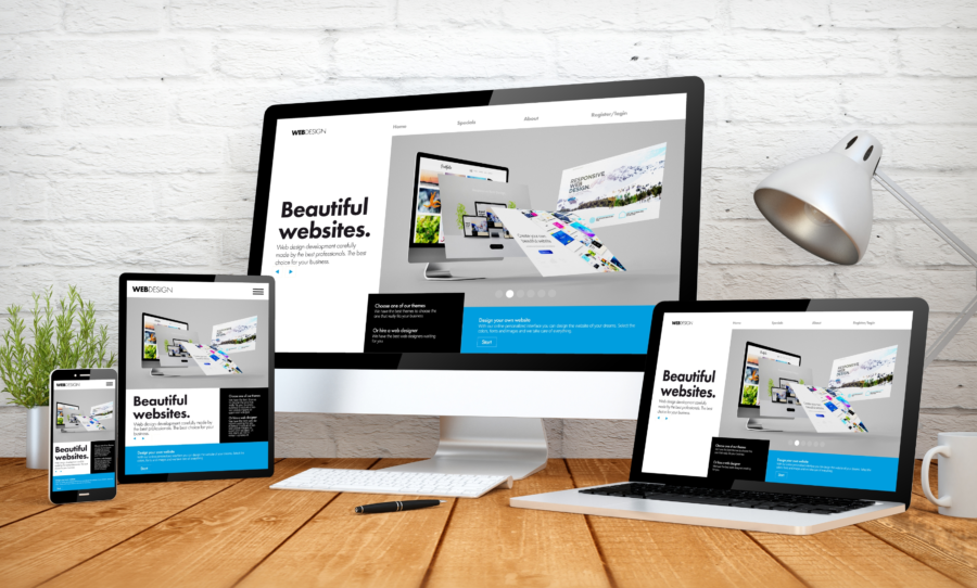
Responsive design is a web development approach that creates dynamic changes to the appearance of a website, depending on the screen size and orientation of the device being used to view it. It’s become increasingly important over recent years as mobile device usage has skyrocketed and traditional PC sales have slowed.
In this article, we’ll take a look at what responsive design is all about and why it’s so important for businesses today. We’ll also explore some of its key benefits and discuss how you can create your own responsive designs from scratch with minimal effort.
So whether you’re an experienced web developer or just starting out in the world of coding, this guide will help you understand everything there is to know about responsive design!
How Responsive Design Works?
Responsive Web Design is an approach to web design that enables webpages to create a tailored and optimized experience for users across all devices. It allows web developers to create websites that automatically respond to the size of a specific device’s screen, no matter what type of device it is.
This includes desktop computers, mobile phones, tablets, and any other type of internet or digital device. Responsive Design enables developers to create websites that can adapt their layout and design elements in order to provide optimal viewing experiences for each individual user based on the size of their display.
Responsive Design works by using CSS media queries to determine the orientation and size of a user’s device. These media queries allow a website’s design to be adjusted based on various factors such as resolution, orientation, and displaying area or screen width/height, among others.
By setting different stylistic changes at various breakpoints (e.g., landscape vs. portrait), Responsive Design makes it possible for a webpage’s layout and elements, such as menus, sidebars, images, and videos, to be adjusted depending on the user’s device and environment.
Moreover, this approach also allows Web Developers to ensure accessibility benefits are included in their design plans, such as text resizing without breaking the page layout and ensuring legibility across multiple devices with different resolutions.
Why is Responsive Design So Important?

Responsive web design has become an essential element of modern web design as more and more users access websites from a range of different devices. This approach enables businesses to create websites that are optimized for any device, ensuring a positive user experience regardless of the size or orientation of their display.
This can be especially beneficial for many reasons, such as:
1. Increased Mobile Usage
Responsive design is becoming increasingly important as mobile usage continues to increase around the world. Many users access the internet primarily through their mobile devices, and a website that isn’t optimized for these devices can be difficult to navigate and lead to a poor user experience.
By creating a responsive design that works across multiple screen sizes, you can ensure your website displays correctly on any device and improves the user experience for those accessing it from a mobile device.
According to the most recent data from Statista, mobile devices account for more than 59% of all global web traffic, and this number is predicted to continue increasing in the years ahead. This makes it even more important for businesses to create responsive design websites that are optimized for mobile devices.
2. Improved User Experience
By optimizing your website for different screen sizes, you can create an improved user experience for all visitors. Since responsive designs adjust automatically to any size, it ensures all users will have an enjoyable and easy-to-navigate experience when visiting your website, regardless of what type of device they are using. This is important since most people browsing the web expect websites to work well on their chosen device and be easy to use.
For instance, a website with a responsive design will adjust the layout and display of its content to fit any device, allowing users to easily find what they’re looking for without having to resize or scroll endlessly. This can help reduce user frustration, as well as increase engagement on your website since visitors are more likely to stay longer if it’s easier to navigate.
3. Increased Visibility
A properly implemented responsive design also increases your website’s visibility in search engine rankings since it makes it easier for search engines to index and crawl your site content due to its single URL structure. With increased visibility comes more potential customers who will find your website when they perform searches related to what you offer.
According to Google, they recommend responsive design as a best practice for the mobile site since it allows them to serve the same HTML code on the same URL regardless of the device that is used to access it, making it easier for Google’s algorithms to crawl and index your content.
4. Cost Savings
Utilizing a single version of code across different screen sizes saves time and money compared with creating multiple versions of the same web page or app designed specifically for each type of device (mobile, tablet, etc.). This also makes future updates much easier since you only need one version instead of several different ones needing constant maintenance and updating separately.
For example, if you want to make a change to the color of your website button with a responsive design, you can just do it once on one version and apply it across all devices. This saves both time and money for businesses who want to quickly update their websites without having to worry about compatibility issues or spending more money on development costs.
5. Improved Performance
Responsive designs help improve page loading speeds by reducing redirects (which can slow down page loading times), ensuring images are optimized for smaller screens, and eliminating unnecessary content from being loaded on smaller devices (such as large background images).
All this helps improve the overall performance of the website by providing a better user experience with quick-loading pages across all device types used by customers.
If you’re looking to give your website a competitive edge and keep up with the latest trends, then implementing responsive design is an easy way to do it. Not only will it save you time and money in the long run, but it will also ensure all of your visitors have a great experience regardless of what type of device they are using.
6. Consistent Branding Across Devices
By having one version of your brand’s style guide applied universally across all devices, you can ensure that no matter where your customers are accessing information about you, it looks consistent and professional in terms of visuals (logo placement, font types/sizes/colors).
This helps build trust in your brand because customers will recognize it quickly no matter which platform or device they are viewing it from–allowing them to feel comfortable interacting with you online in whatever way works best for them–which leads us nicely onto our next point…
7. Enhanced Engagement
When you have a responsive design, it means that everyone can see your website equally well, no matter what kind of device they are using. This is important because not everyone has access to a computer, or they might not want to view certain content on a computer. But if they can view it on their phone or tablet, they might be interested in it. This helps boost return visits and encourages new visitors too!
Imagine if you had a great marketing campaign, but no one could see it because your website wasn’t responsive–this would be incredibly frustrating and possibly even a waste of money.
By making sure that everyone can view the content on your site, regardless of device type, you open yourself up to more potential customers – which is essential for businesses in today’s digital marketing world.
8. Enhanced Security
Having one concise code base rather than several disparate versions means there is less room for security holes or vulnerabilities present within each individual code set which could be exploited by hackers trying to gain access to sensitive information.
This helps keep customer data safe and reduces the chance of system downtime due to malicious attacks. Outdated programming languages are used in older frameworks, but newer standards such as HTML5 & CSS3 are used more now.
Legal Requirements of Responsive Design

In some countries, it’s a legal requirement to have an accessible website with a responsive design. This means that if you don’t make your website responsive, you could face hefty fines or other legal issues.
Accessibility Requirements
When it comes to designing a website that is responsive, one of the most important legal requirements is that the website should be accessible to everyone, regardless of physical or mental impairment. This means that the website should be designed in such a way that those with visual impairments can still enjoy the content on the site by using screen readers, while those with mobility impairments can use assistive technologies and keyboard navigation to efficiently navigate their way around the website.
It is essential that responsive design adheres to the legal requirements of accessibility. In order for websites to be legally compliant, they must meet all relevant accessibility standards, such as achieving an AA, or better, level of compliance with the Web Content Accessibility Guidelines (WCAG) 2.0. This means ensuring that web content is perceivable, operable, understandable, and robust for people with disabilities. This includes providing audio descriptions of images on a website and making sure all elements are keyboard-accessible.
Furthermore, any audio or video content must also provide transcriptions and captions for those who are deaf or hard of hearing. And designers must also consider color contrast when creating a website, as many color combinations may be difficult for those with different types of color blindness to see. All text on a website should ideally be able to reach at least a WCAG AA level of conformance so that all users can interact with the site without any difficulty.
Best Practices for Responsive Design
When designing a website, there are several best practices designers should follow in order to ensure their website is as responsive and user-friendly as possible. These best practices include:
1. Understand the Context
To build a successful, responsive design, it is essential to understand the context of user behavior and device capabilities that will be used for viewing your site. This means researching target audience profiles, analyzing which devices they use on a regular basis, and understanding how they interact with content across those devices.
Also, it’s important to ensure that all functionality and content are available regardless of the device being used to access them. For instance, if a user is viewing your site on a mobile device, they should still be able to access the same features that are available to desktop users.
Here’s how you can understand the context of user behavior and device capabilities:
• Analyze target audience profiles, specifically what devices they use. Your organization’s Google Analytics data is a great source for this information.
• Research other websites in your industry to better understand user behavior and device usage. This will help you understand what works and what doesn’t work for similar responsive sites.
• Take into account different types of users and different types of scenarios when designing. For example, consider how someone might use your site if they are in a hurry or have limited time.
2. Utilize Content-First Design
Content should be at the forefront of any responsive design project as it will ultimately drive the user experience across all platforms and devices. This means taking a “content-first” approach and designing around the needs of users rather than trying to fit content into a predetermined template or design.
In addition, this means making sure there is an appropriate amount of white space in order to provide clarity between various elements and let users focus on what’s most important on each page. While white space is important for desktop and laptop designs, it is even more crucial for mobile and tablet devices due to the limited amount of screen space available.
3. Utilize Flexible Grids and Layouts
A flexible grid system is an essential part of creating a responsive design that can work across different screen sizes and orientations. Flexible grids are built on relative units such as percentages or ems so that sizes can be adjusted proportionally depending on the screen size being used to view them.
Furthermore, layouts should also utilize flexible techniques such as media queries in order to display content differently depending on the device being used and provide an optimal experience for users regardless of their platform or device type.
To utilize a flexible grid and layout system, designers should:
• Utilize relative units such as percentages or ems to size elements of the design.
• Use media queries to provide different styling rules for different screen sizes or orientations.
• Make sure all elements on a page scale proportionally when resizing the browser window.
4. Optimize Images and Media
Images and videos can present unique challenges when creating a responsive design due to their variable nature in terms of size and orientation across different devices. It’s important to optimize images by using proper file formats, compressing where needed, setting default image sizes, using hidden attributes for higher resolution displays, utilizing image sprites when possible, and including alternative text descriptions for accessibility purposes.
In addition, consider utilizing HTML5 video tags instead of relying solely on Flash-based solutions, which may not be universally compatible with mobile devices or other platforms like iOS or Windows Phone 8X/10X devices.
To optimize images and media, designers should:
• Use appropriate file formats such as JPEG or PNG for images: The type of image will determine which type is most suitable. Your designer or developer should be able to advise you on the most appropriate format.
• Compress images when needed: This can help reduce file sizes and improve page loading times, especially on mobile devices where data speeds may be slower.
• Use hidden attributes for higher-resolution displays: Images can be set to appear in higher resolutions depending on whether they are being viewed on a high-resolution display or not.
• Utilize image sprites: This can help reduce the number of requests made to the server, which can help improve page loading times.
• Include alternative text descriptions for accessibility reasons: Images should have descriptive alt attributes that provide additional information about the image if it can’t be seen or accessed by a user.
• Utilize HTML5 video tags: This will ensure that videos are accessible across all devices and platforms without the need for any additional plugins or software.
5. Test Across Platforms and Devices
Testing is one of the most crucial aspects of any web development project but especially when creating a successful, responsive design that will work across multiple platforms and device types.
It is important to test extensively across different browsers on desktop computers but also all major mobile operating systems, including iOS, Android, Windows Phone 8X/10X devices, BlackBerry OS 10+, etc., as well as tablets in both portrait and landscape orientations. Also, automated tools like Responsinator can help identify potential issues before launching a new site or working through changes during updates.
The best way to test a responsive design is to:
• Test across all major browsers on desktop computers: In addition to Chrome, Firefox, Safari, and Edge/Internet Explorer, it is also recommended to test on Opera and other lesser-known browsers.
• Test across all major mobile operating systems: This includes iOS, Android, Windows Phone 8X/10X devices, BlackBerry OS 10+, etc.
• Test in portrait and landscape orientations: Make sure that all elements of the design scale properly when orienting the device from portrait to landscape and vice versa.
• Utilize automated tools like Responsinator for quick checks: This can help identify potential issues before launching a new site or working through changes during updates.
6. Embrace Progressive Enhancement
Progressive enhancement is an approach where web applications are built from basic functionality upwards, meaning developers start with basic HTML structures first, then layer style sheets (CSS), scripting (JavaScript), multimedia components (audio/video), authentication features, etc., according to browser capability. This ensures maximum compatibility across diverse browsers having a maximum width while enabling more advanced features in better-equipped browsers such as Chrome or Firefox.
7. Optimize Performance
When you are creating something for mobile, always think about how to make it work better. This means making the code better, so it loads faster on different networks. You can do this by minimizing HTTP requests, minifying resources such as JavaScript/CSS files, combining files wherever possible, caching static assets, etc. Plus, tools like Google PageSpeed Insights can help you find problems before you launch your project.
8. Incorporate Usability Best Practices
Creating easy-to-use menus, buttons that are easy to see and click on, and using touch gestures like swipes where it makes sense, are all key parts of making sure people have a good time using your app or website on different devices. Think about how people will use your app or website while you are planning and building it. This will save time later if you need to make changes based on what people say after they test it out.
9. Ensure Accessibility Compliance
When you are building a website, it is important to make sure that everyone can use it. This includes people with different abilities. You can do this by following the WCAG standards for inclusive design principles, such as color contrast requirements and keyboard navigation support. This way, everyone can enjoy using your website equally.
10. Perform Maintenance Checks Regularly
It is very important to keep your website running smoothly after it is launched. Make sure to check it regularly for any problems and run periodic maintenance checks. This will help keep your website secure against potential threats.
To perform these checks, you can use automated tools like Monitis or Site24x7 to keep an eye on your website’s performance. They will alert you if there are any problems so you can fix them quickly.
Bonus Tip: Leverage the Power of Automation
Automated testing and optimization can be a great way to ensure that your website is working as expected. Automation can help you quickly identify issues and save time in the process. Tools like Ghost Inspector, Selenium, and Appium are great for automating tests on different browser width and devices. They simulate user actions so you can make sure everything works properly before launching your project.
In addition, there are tools like Google Lighthouse and WebPageTest that can help you optimize your website for better performance. These tools score your website based on various metrics, such as loading speed, accessibility compliance, etc., so you know where to make improvements.
Conclusion
Creating a successful mobile website or application requires careful planning and execution, with plenty of considerations to factor in. By following the tips outlined above, you can ensure that your site is optimized for different devices and ready for users to enjoy.
However, make sure to keep an eye on your website’s performance and update it regularly to ensure that everything is running smoothly. With the help of automated tools, you can quickly identify any issues before they become a problem.
Through careful planning and execution, you can create something awesome for mobile users that works well across diverse devices, networks, and other factors.
FAQs
What is responsive design?
Responsive design is an incredibly useful web design tool, allowing websites to adjust their layout, fonts, and images depending on the size of the viewing device. It makes for a better overall experience for users as it makes navigation easier through reorganizing elements and resizing display content.
Whether viewing from a computer screen, tablet, or smartphone, websites designed with responsive design ensure that all visitors get the same level of functionality irrespective of device choice. Not only this, but the responsive design allows for better search engine optimization due to its ability to give webmasters more control over the presentation of code from different devices.
What are responsive design principles?
Responsive design principles, or RDPs, are techniques for creating digital content that adjusts automatically to a user’s device. Whether you’re on a smartphone, tablet, laptop, or desktop computer, the website you’re viewing should adjust to the size of your screen resolutions, so it looks and functions optimally regardless of the device.
This is why RDPs are so important today: not only do they make browsing more enjoyable for users no matter where they access your content from – they also help web developers streamline the development process by eliminating the need to create separate versions for different devices.
What are the three main components of responsive design?
Responsive design is crucial for any website today if you want your visitors to have a positive experience. It consists of three main components that act together in harmony to ensure your site looks great, no matter the device. The viewport is an HTML tag that tells the browser how to logically scale its content and display it on any device.
Flexible layouts determine the web page’s size and orientation which give content flexibility on different devices. Finally, media queries are used to create breakpoints so different styles can be applied when necessary. Together these three components ensure that your responsive website looks beautiful regardless of a user’s device width or screen, or font size