Are you unhappy with your own online store?
So you’ve got your Shopify store up and running, but it’s not looking too hot. maybe you just needed to get an eCommerce website up and running as fast as you possibly could and add new sales channels. Or maybe you’ve had an eCommerce site for a couple of years. And it looked great when you launched it. But it’s starting to look a little bit out of date and you’re not getting enough online sales. Now, bottom line, you don’t love your eCommerce website, and you want to do something better. And that begs the question: How do you make your Shopify store look good?
I’m Kellis Landrum, I’m the co-founder at “Truenorthsocial”, we are a digital marketing agency based in Los Angeles, we are Shopify partners, and we are here to help you learn how to market your business online. If you want to find out how to make your Shopify store (or any store you want to use Magento, Bigcommerce, any eCommerce platform works) we are going to show you how. So let’s dive in.
Start with your header and footer
When we do eCommerce website design, we do it in little bite-sized chunks. And the place to start is with your header and your footer. These are easy to overlook. A lot of people overlook these. But they’re literally on every page of an eCommerce website. These are huge branding opportunities because they can contain your logo, your brand colors, maybe even some branded typography. When you look at your header and footer, you must look at them on both desktop and mobile devices. These are vital for navigation. So we need to make sure they’re done right, that means not too big, not too small. And on mobile devices, you need to make sure that the links are spaced far enough apart for people with big fingers.
So let’s take a look at some examples. So a very nice example of a header here is (yorapetfoods.com). Up here, this is our header. This is what we’re looking at. Let’s click over here. And as I mentioned, you can see there’s their logo, they have some branded typography up here, they have colors already going on, they’ve even put some products that you can see inside one of their dropdowns.
Here, this is pretty nice merchandising. Now, on the homepage, when you load this, this is transparent. But as you scroll down the page, you start to see a purple kind of transparency here. It looks like it’s blurring stuff in the background a little bit. But again, yellow, and purple are their brand colors along with green. And that is pervasive as you scroll down the page they choose to, they chose to do a sticky header here, which is great. I like that a lot. When you look at this on one of the other pages, most pages on an eCommerce site that aren’t on the homepage have a white background. So it looks like they’re doing some purple at the top of this one, see if we can find one that.
So this is on white. And they just do the background of their header here and this purple bar with yellow at the top. And it looks like it stays solid on the other page, or the other pages, I should say. But a very nice treatment for a desktop version. Let’s look at the mobile version here. As you can see here, the navigational elements are bundled up into this hamburger icon, which I think is very common.
And when it pops out, there’s some big stuff in here. But you’ll notice the “Yora” store name, and in of itself doesn’t take up a lot of vertical real estate. And that is very useful. Because usually when we’re looking at things on a mobile device, we want to utilize as much real estate as we can here. This is a tall device. We usually when you look at things on mobile, they’re tall. So you don’t want your logo to start taking up a bunch of vertical real estate, real estate and push all this stuff down.
But once you open up the menu, you can make things a little bit bigger than that is pretty helpful in terms of helping people understand the priority. So this is a pretty nice example. So by contrast, your ecommerce site may look a little bit like this. If you haven’t got to redesign it yet, you’ll notice this header takes up a lot more vertical real estate. And the reason for that is this person has designed their logo square. I know we’re talking about ecommerce website design rather than logos. But one thing to focus on or to think about, is when you design your logo, especially if a lot of your presence is going to be online as you want it to work well horizontally rather than just vertically.
And if you look at Yora’s their logo is not very tall, it’s much wider. So you’re able to see this pretty big. You’re also able to read the name very, very clearly whereas this, they’ve kind of shrunk down the name “Molten Mits” to make this illustration of the gloves a little bit bigger. And this would serve them a lot better if you could read the name of the company a bit bigger on the desktop.
Now watch what happens when I go to my mobile here. It shrinks down. It takes up more vertical real estate than the “Yora” logo does. And it’s harder to read on top of that. It’s just not doing you a whole lot of good free worldwide shipping that is bigger than the name of this company. So I would say this is a good example, looks like there, they’re kind of hidden in here. This wasn’t designed, really great. But these are some of the kinds of things that you want to look at when you’re looking at this, Oh! I forgot to add, let’s take a look at the footer. So let’s make sure that the footers are not so bad, this is pretty standard, except I would get rid of these payment logos. I think that’s kind of a dead giveaway, that you haven’t done a lot of design work for your site. Let’s take a look at it. Okay, so it’s pretty clear what all these things are. They’re well organized, they do have a few payment logos in here, but at least they’re kind of grayed down a little bit. And on a mobile device.
So we’ll scroll down here. So everything stacks up, this is pretty much what I think you’d expect this to be. So all in all very clear examples of what you want out of your header and footer and maybe what you don’t want so much.
Nail your Banners
So the next tip to make your Shopify store look good is that “Nail-Your-Banners” along with the header banners are usually the first thing someone sees when they come to your eCommerce store. When you hear people talk about the design of online stores, usually this is what they mean. So what’s the difference between a good banner and a bad banner? How do we make ours great? It should be to a specific product, a specific collection, or an event. I can’t make this too clear. I’ve seen a lot of stores use banners to promote their brand. And this is a missed opportunity. You can promote your brand further down the homepage or on the About Us page.
You want to use your banners to tell people what to buy. The next thing is your banners have to have a great image; e-commerce is all presentation so your customers can look but they can’t touch if your product looks bad selling, is an uphill battle. The next thing is the image that you’re using needs to focus on the product or the collection that you’re selling. The product needs to be prominent. I’ve had clients give me images with a ton of stuff in them and the pictures this big, and the products this small, and I look at these and I go “How do you know what you’re buying when you look at this.” So don’t do that. Don’t make your customer guess. Because they probably won’t, they’ll probably just leave.
Last. But maybe most importantly, your banners need to be responsive. That means wide on desktop tall on mobile. This is especially true if you run Facebook ads, if the majority of Facebook’s traffic is on mobile devices, guess what kind of traffic they’re going to send to your site. When you run Facebook ads. If your banners look good on desktop, but not on mobile, most likely you’re wasting your ad dollars. So that said, let’s look at a few examples. So we’ve got a few examples. Here we can look at showing various things that either work or don’t work. I think this “CHA” here, this “CHA” site and it has most of them. When I look at this banner, there is no clear call to action. Here’s what the store does, but that doesn’t tell me anything to buy.
They sell medical supplies here, this looks like it’s probably a stock photo, I don’t know if it’s a product they carry or not. But there is no button to click on here. This thing doesn’t go anywhere. So it can’t take me to buy something specific, it certainly doesn’t have a great image. Also, when I click on here and inspect this on a mobile device, it is not responsive. So when I talk about desktop banners being wide, and mobile banners being tall, this one, they should have a different version of this, this that gets served on a mobile device, or it should be responsive in some way.
But this one is not. So not the greatest banner, let’s see “Evin Bags” does not have a banner. It’s got a picture of some product below this with no text. These are the kinds of mistakes I see in stores all the time. It’s surprisingly common, unfortunately, “Xinx-Wireless”, I guess these guys’ cell phone wireless chargers, but there’s not a specific one here they’re selling that doesn’t click to anything, and not a great image.
And again, this is not responsive. Kind of hurts my eyes a little bit. Let’s keep going through some of these. Okay, so this one at least looks a little bit better. I don’t know if this is a stock photo or something somebody took but it’s at least a nice picture. There’s some nice text, all the images, and all the typography is baked in here which I like, but “what does this store sell?” I don’t know at least just by looking at the banner and once again when I click on this it gets tiny.
Nice picture but don’t tell me: “You were made to flourish” Gut, Brain, Sleep. Oh! They sell supplements. That was not I figured maybe they sold sunglasses or I don’t know funk cases or something, I don’t know. But I got to guess at this one. Let’s see “OpticFX”, high-quality glass lens filters. But again, I don’t see a picture of a lens filter here, the second banner here doesn’t have anything at all. I think a lot of these people must just use default themes and don’t do anything to optimize them on Mobile. I’ve noticed that with a lot of pre-built themes, they don’t come with a separate upload for a mobile banner.
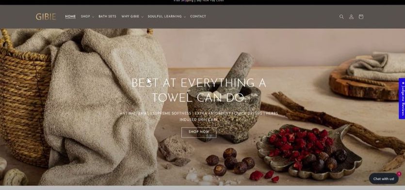
Or maybe if they do, people just don’t use them, because they don’t know they’re available. Okay, so this one is “Gibie”. I thought this is much better photography, they are telling me everything that it can do. This is the thing is most people don’t read stuff a lot. And this picture has a lot of other stuff in it besides just a towel, they have text running across their image, which goes over the towel, which I don’t like to do. If we take a look at this on a mobile device, now our towel gets smaller, it’s cropped off the side, this thing is a little bit more in the center, the text does go below it because this is built with a through HTML.
So at least they sing separately a little bit. But just by looking at this, I would think they sell mortars and pestles or sea salts or meditation stuff. I don’t assume anyone is going to read anything on it. Maybe if I make it real big, then I have a good shot at that. But “Gibie” is kind of halfway there.
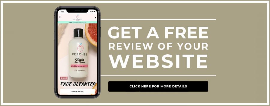
Let’s see, this is “Aqua Pillar”. Okay, so at least I’m pretty sure they sell shoes, I don’t like that their type is running across their product, this goes to a collection rather than a specific page. But running type across your product covers it up, and I want to make your product look great, I want this to be as presentable as possible. Once again, they don’t do a mobile responsive banner, like I don’t know why it’s so hard to find these things. But let’s take a look at when this is done properly. I designed this online store, this is “Peaches Skincare”. So they’re featuring Flawless Exfoliator. I’m a guy, so I don’t use this product. But we made it look nice, we shot the product very big.
Some things decorate it. But that’s about the size of it. And when we look at this on a mobile device, now I created a separate version of this banner that is tall. And for this online store, I would say like 80% of their traffic is on mobile. So most people are going to see this. And this is kind of what we’re looking at. This is a collection of a few products. Since this product is a bottle, it’s tall, and it fits this format very well. So generally, what we’re mostly focused on is how things look on a mobile device. But it’s a pretty typical idea of, what you want to think about when you look at a banner.
Organize your content into blocks with headlines
Okay, so next Tip, you need to organize your content into blocks with headers, so your customers don’t read, they scan. So I need to accommodate for the fact that people are going to scroll down my page super quick and not read anything. So the question here becomes how do I communicate quickly? Well, the answer is I need to organize my content into an outline. Each one of my blocks should be about one specific thing. You can see from my example here with “Peaches Skincare”, I’ve got each of my blocks numbered out like I’ve got my first block is going to be a banner, and I’m going to have three slides in my banner. One is going to be a collection and two are going to be products, then my second block is going to be some brand info, my third is going to be some featured product, fourth is going to be an Instagram feed, so on and so forth.
So these are all focused on one specific thing. And naturally, I can switch the order of these around later if I want to. That’s not that big a deal. And in fact, I don’t have to have these written out from the beginning. I don’t have to have everything just perfect to do this. I can just get my outline done and then figure out exactly what I want my content to be later on. So once you get your outline down, you remember I mentioned that each block needs a short headline that can be read in a few seconds. For some of these, it’s pretty easy for a featured product, I’m probably just going to say featured product at the top of that block and show you a bunch of products. But with brand info, you’ll see the text down towards the bottom here says “Peaches focuses on helping you achieve perfect skin.” That is my headline. It’s 1, 2, 3, 4, 5, 6, 7, 8 words long.
It’s a little bit longer than I usually like but you can still read this in probably two to three seconds, I’m assuming that people will not read the text underneath that on their first pass. But if they read this headline and understand that this is the purpose of what peaches are trying to accomplish, they’ll at least get some idea. This is what the brand is about. And if they want to know more, they can always scroll back up and read the text. And that’s going to help them to figure out if this site is relevant to me or not?
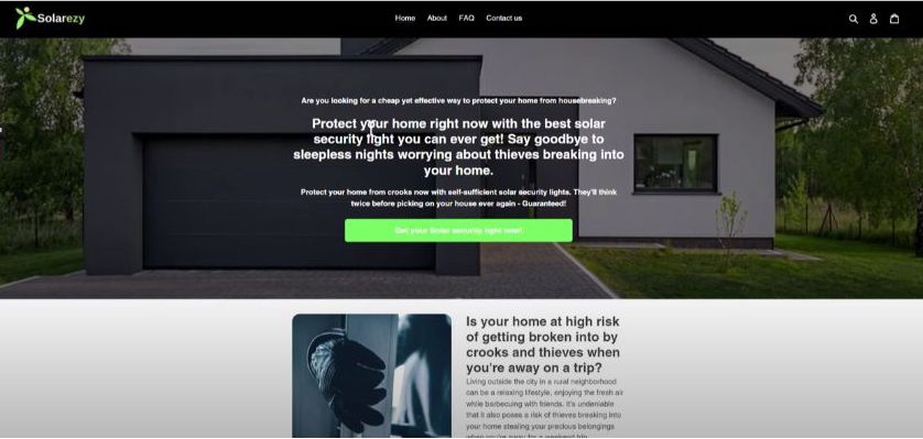
So here’s an example of a not-so-great way to do it, just to illustrate what they shouldn’t look like “Solarezy here. So there’s a lot of text going on in their banner here. And it’s all pretty close together. I’m assuming that when someone looks at this site, they’re going to come to it. And they’re going to do this. Look at the pictures, they’re “Solarezy” lights. Now, what am I interested in? So that is generally what people do. So, to their credit, they do have some headlines, as well as smaller text, this looks like enough text to be broken out into several banners. But really, what they want you to do is click on the product page they’re doing.
I’m okay with explaining the value of your product, you just have to break it up into smaller bite-sized chunks. As I mentioned, these look like they’re one block, but they could certainly be broken into two blocks, there is only one call to action in both of these. And I could see if you, if you have this much text, probably what you want to do is put some of this text onto another page, it could be that they’re trying to do some search engine optimization with the site. So they have a lot of text on it. But again, if you want to have a lot of text on the page, you just need to break it up into smaller pieces. And some people who do SEO realize this, some people don’t.
But you can hide a lot of this extra text and hide in show menus, which is a little JavaScript with a button and you can have something like read more with an arrow next to it, and you click on it. And that reveals all of this text when you click on it, and Google will be just fine with that. As a general rule, I do like looking at pictures, these things I don’t have to read, I can see this picture of this house of I guess burglar hands, side of somebody’s wall with some lights. We got a pie chart here Burglary committed types, and a secret document book it looks like, and then some pictures. I guess this must be the actual product.
So these are some lights, I didn’t look at this site. Too much to be honest, like, a lot of times when I look at an online store, I don’t care what the product is. Generally, I want to look at it very quickly, and be able to understand what it is without having to read anything. And I got down here before I was able to understand that this product is a light, “solar interactive wall lamp”.
So how does that help you with security? I guess if there are lights on people won’t break in your house. I suppose it can’t hurt. But so yeah, this is just kind of disorganized, it means I have to read a lot to get into this product. Oh, as I mentioned with banners, they’re not showing me their product right away. They’re just making me read to understand what this is and show me a picture of a house. But it’s a pretty dark house, it looks like it can use a light out here. So yeah, as a rule, you want to show people immediately a product to buy, that’s just generally going Merchandising, and then down here, I would start getting into what the value of this product is. For me as a consumer, it’s going to help deter burglars and I would also start immediately telling my customers about why my product is better than other competing products.
Maybe because it’s solar-powered. I’m sure there are other solar-powered lights out here. Okay, so features and benefits, this is great. I would also tell people “Why my solar-powered light is better than all the other solar-powered lights”, there is some certain sort of design to this and how it illuminates to the sides and down at the same time. Maybe that it’s lightweight, it’s easy to mount, or that it charges up fast during the day or holds a charge long at night. There are a lot of things that you could be telling people about this product these guys have just chosen not to. So again, you want to outline the content block one, block two, block three, block four, block five. You want to have shorter headlines than certainly some of these. And you want to communicate your ideas very quickly, clearly, and concisely.
Tell a story
Okay, the next tip to make your Shopify store look great is to tell a story. This is a high watermark up to this point we’ve been working to try and make our online store not be bad. Now we’re going to focus on how to make it good. Storytelling is the difference between brands and commodity products. Lots of brands can make soda but there’s only one “Coca-Cola” when you’re telling your story “Imagery Is King”, nothing will make or break an E-commerce website faster than the quality of the photography, good photography can make bad products look great and bad photography can make great products look awful. Nothing will kill your online sales faster that this, especially on product pages.
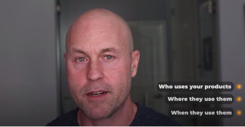
Keep in mind, customers are buying an image of your product, not the actual product, they can’t touch it, they can’t feel it, they can’t hold it and see how heavy it is. All they have to go off is the image. But you can use this to your advantage, you can show your product in the best possible light, literally. So you want to show them an idealized version of life with your product. Show them who uses your products, where they use your product when they use your product, you want to give them context and make their lives better, more enjoyable in some way, even if it’s only for a short time.
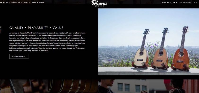
So as an example of how to tell stories through an online store, “Ohana Ukuleles” is a client we worked with a little while back. Telling a story about what type of Ukulele they sell who uses a ukulele what your life is like, as a ukulele player, a Ukulele enthusiast, I guess, is probably the right word. They get into this is because they’re a pretty big ukulele manufacturer. And suppose there’s a certain type of musician that plays Ukulele. But they’re telling you a little bit about their quality, their playability, their value, I think these are a mid-range Ukulele, they’re not the fanciest ones. But they’re not the cheapest ones.
But the way their product is shot, they had a photographer go through and shoot these Ukuleles and a way that just makes them look nice. And they do have some Ukuleles that are beautifully made. As you can see some of the types of wood that they use in their Ukuleles are photographed just fantastically. And this is what I was mentioning about how good photography can make a product shine as you can kind of bring out the beauty of your product. But if you light it incorrectly, maybe you don’t see as much of this.
This is really about the presentation of your product, and about how it is shown, showing these things from different angles and different circumstances, that kind of thing, then we hold it, and that sort of thing tells you a lot about this product. And in some cases, some people will like more just the regular looking guy who uses this sort of product. And then some people want to look a little bit different. And maybe that’s why they play the Ukulele in the first place.
You can get sort of the general vibe of the Ukulele lifestyle from looking at this page. So quite a few others that we created for this online store about the manufacturing and the process. I think this is still family-owned, this is an om-and-Pop kind of business, but fairly big for a Mom and Pop kind of business. So you can get a little bit more of an idea of the story of this company. By looking through different sections of this online store. I think these are their sponsored artists.
So, different Ukulele player, you probably know who the different Ukulele players are. And you might know some of these guys and feel this is the right type of Ukulele for you in the range of different Ukulele options you have out here.” so for this type of product, this is a great presentation. And you just want to think about, “How does your product fit into the lives of people who use your type of product?” and show it to them in a way where they feel like yeah, this is the kind of life I would like to live.
Show them what makes your brand different from your competitors
Our next tip for making your Shopify store look great is to show your customers what makes your brand different from your competitors, even if it’s just the story itself. There’s a lot of competition out there. So you want to give customers a reason to buy from you instead of some other store owners. Tell them about the quality of what you offer. The key feature of the manufacturing process is the exotic origin. Anything is better than nothing. So let’s look at some examples here.
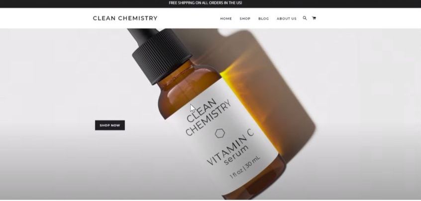
So first, we’re going to look at “Clean-Chemistry”. Now, when you look at this, the product photos of this bottle are nice. But as far as what this product does, hopefully, what Vitamin C Serum is or does. But as far as what makes this vitamin C serum different, or I guess resurfacing serum, absolutely no information. Now, if you Google Vitamin C serum, you’ll come up with probably dozens, if not hundreds of other companies that sell a vitamin C serum, which leads me to believe that most likely this is a Drop-Shipped product, it’s possible that these guys got somebody to put their label on this product rather than the manufacturer’s label.
I’m saying that just because this well, this label is plain that the typography on it is pretty nice. Maybe they got somebody who’s not the manufacturer to do that. But I can guarantee you that this, this company doesn’t produce this product because they would know something about this product, they would say something about it, what makes this product great or different or better than the dozens or hundreds of other companies selling some kind of vitamin C serum that is out there. This is a huge part of the online shopping experience and an opportunity that a lot of Shopify store owners miss. So while those product photos are great, they tell you nothing about the manufacturing process, the origin, or what this does. Why is it better? There’s nothing like that in the entire store. I can virtually guarantee there would be more sales with that information in place.
So by contrast, let’s look at “Cut & Sewn”. So this company makes “Side Sleeper pillows” or the perfect pillow for side sleeping. So immediately, we designed the site, we wanted to tell the customer what this product does and this is a Side Sleeper Pillow, what the need for this pillow is? all this time you’ve been sleeping with the wrong kind of pillow. Side sleepers are a little bit different product. So we’re telling people how it works. These are some, just general sales information about why this product is of value to somebody. And what makes it different.
Our curved shape, so Side Sleeper pillows, as you can see here are curved, it’s a little bit different than a normal pillow. So you can see that you get a very quick idea of that. Here’s some stuff to buy the product. Some here’s some logos from different, I don’t know, I guess vegan approved is this probably something that we need the “Forest Stewardship Council” is not I can tell you what the Forest Stewardship Council is, but at least looks like they’ve been approved by somebody somewhere out there.
If you want to see how this product is made, you can click on this video and watch a little bit about the manufacturing process. So that can’t do anything but help to know that there you can adjust the firmness of this product, you can unzip it and you can take some of the stuffing out I don’t know if that’s true of all or most side sleeper pillows but I’m sure some of them don’t have a zipper and you can’t adjust the firmness so just letting people know that that is possible is a unique selling point.
The quality is very good even if they didn’t have anything to back this up. Just saying that this is superior quality is something if your competitors don’t say that. But this is made in California by American workers who are paid a living wage. If you bother to read this then that’s nice. We talked to them about making “Made in the USA” that headline but they didn’t want to focus on that for reasons of their own. Worry about free materials.
So this gives it some people will be concerned about what they’re putting their face next to sleeping. So just saying highlighting that this is toxin-free and hypoallergenic is kind of nice. So these are all really good key selling points to the product and if someone Google’s Side-Sleeper-Pillow and they find three or four or five of these and their competitors are not talking about any of this stuff. This gives the customers a reason to buy from this company instead of one of the competing ones.
Video is your friend
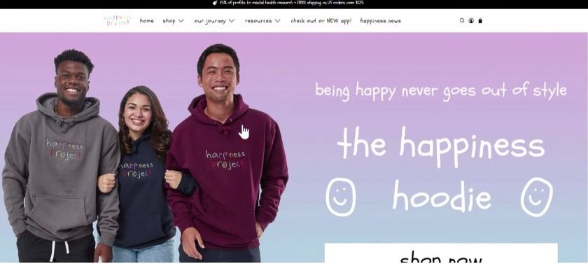
Okay, last but not least, video is your friend. Video can be kind of a secret weapon because some people who won’t read will watch if you’re trying to do SEO, video will help your time on the page tremendously. Video can create a brand vibe through music and action that just isn’t achievable any other way. So we worked on the online store for the “Happiness Project” a little while back. If you’re not familiar with the Happiness Project, this is one of my favorite clients lately. They started with an Instagram account. And mostly what they post is little comments of people talking about mental health This was one of those brands that essentially started selling merch because their Instagram account was so popular and their message is fantastic “being happy never goes out of style” I wholeheartedly agree, they’ve got some product, I even talked with them about the fact that there’s a lot of brands out there that sell hoodies, and Tie-dyed stuff.
But what makes your brand special is the fact that you guys donate a percentage of profits to mental health resources, and that you guys raise awareness that has mental health issues, and about getting help for people who have mental health issues and taking some of the stigmas away from it. A lot of the posts on social media are just talking to people about what they can do, if they feel like they’re depressed, or they have some kind of mental health issue.
And it’s fantastic, I highly recommend checking it out. One of the things we’re excited to get on the newest version of their online store was this video from Jake Lavin, who’s one of the store owners about his struggles with depression and reaching out to get the help I, I’m going to turn the sound down on this because I don’t want to make you guys listen to it while I’m talking over it. But this is a video of Jake in a room.
But this is a video of Jake in a room just talking to the camera. And this was shot with an iPhone, which I told them for any other brand I wouldn’t recommend. But for them, this idea of just doing the best you can and that it’s good enough that you’re good enough, these fits in with their brand, and it’s perfect for it. So depending on what you’re doing, there are a lot of different ways to shoot video.
But having a store owner tell a personal story that people can relate to is huge. I mean, that’s an incredible way to create authenticity and a brand’s online store. And this is exactly the kind of video that I think is perfect to go on the homepage. This is not the only way to shoot a video to put on your homepage, you can talk about the manufacturing process of your product or all sorts of different aspects of it. But having someone tell a personal story about the product and the brand. I mean, it’s hard to get too much better than that.
And that’s it. I hope this video has been useful. I hope you’re ready to create an awesome Shopify store. If you have any questions feel free to leave them in the comments below and reach out to us anytime at truenorthsocial.com.
